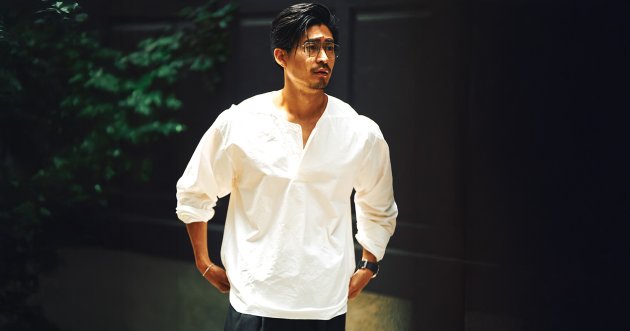
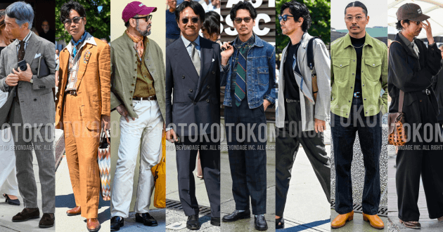
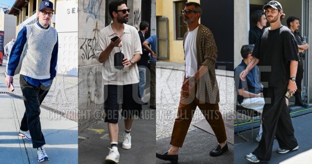
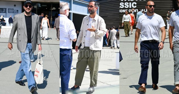
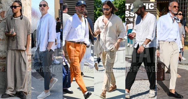
Light-colored coordinates can add a sense of calm and sophistication. It is a coordinate that has been popular among women and is slowly gaining popularity among sensitive men as well. In this issue, we will introduce tips and noteworthy outfits that lead to successful styling based on the theme of light-colored coordination!
CONTENTS
Sponsored by
What are light colors?
As the name suggests, light color is a general term for light colors. It roughly refers to colors with lightness ranging from white to intermediate colors. Pale tones, pastel colors, neutral colors, and dull colors fall under light colors. However, there is no clear definition or standard for the term “light color,” and it is a matter of personal subjectivity, which can lead to some differences in perception. In this article, we will introduce the coordination built with light colors as light-colored coordination.
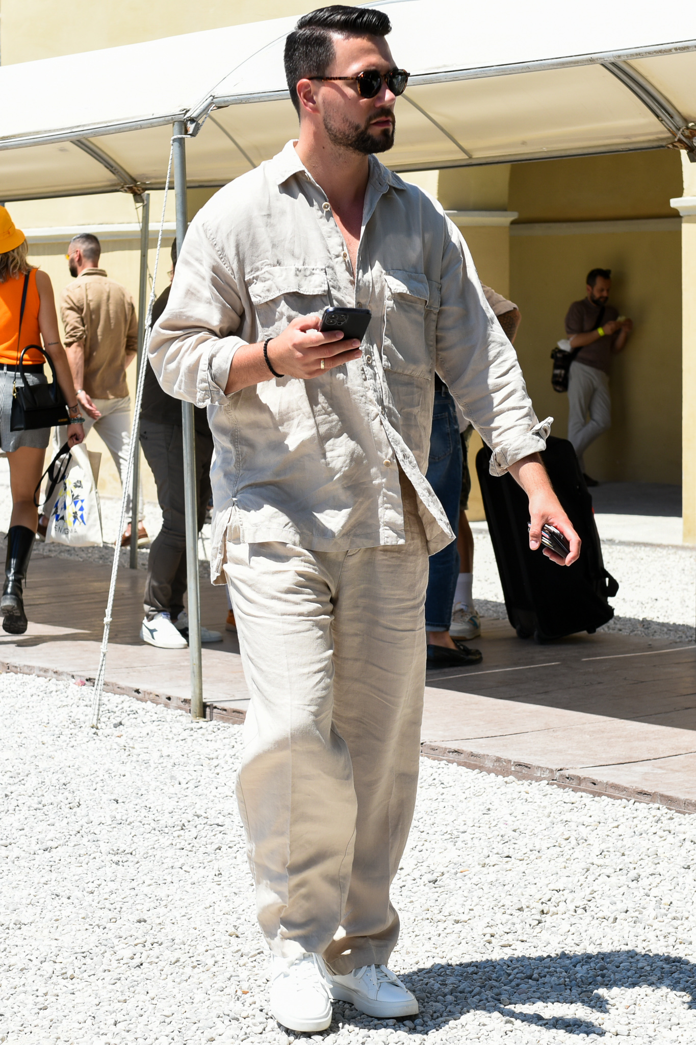
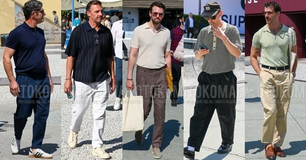
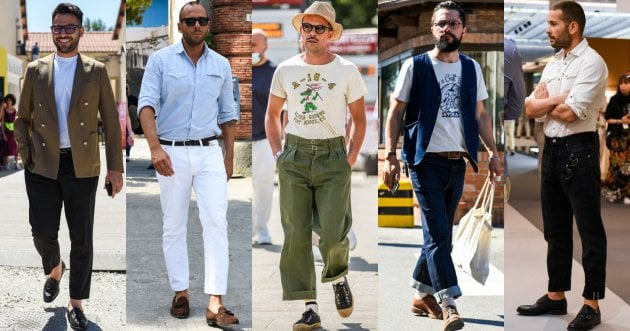
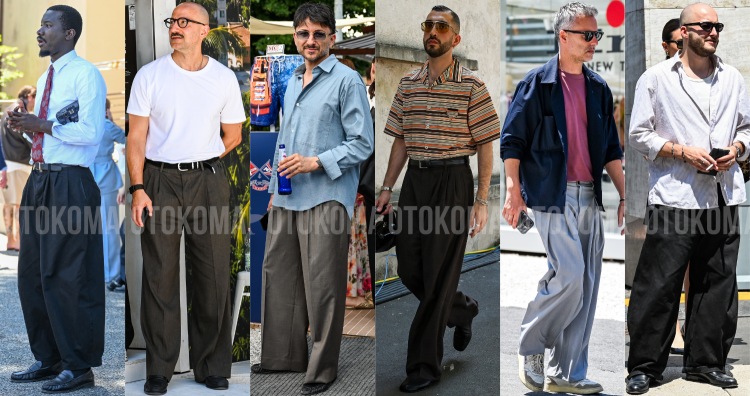
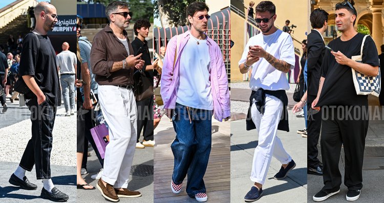
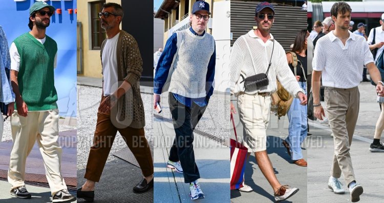
What are the best light colors to incorporate into men’s coordination?
Light colors that can be easily incorporated into men’s coordination range from ivory, mainly white, to beige, which blends well with the skin. The cleanliness and softness of these colors are sure to make a good impression. In terms of ease of use, pale blue, like faded jeans, is also recommended. On the other hand, pastel colors that look feminine are difficult to match with other colors and are more suited to accentuate your outfit. Dull or faded colors are more suited to men’s coordination.

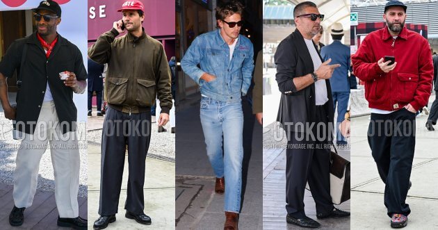
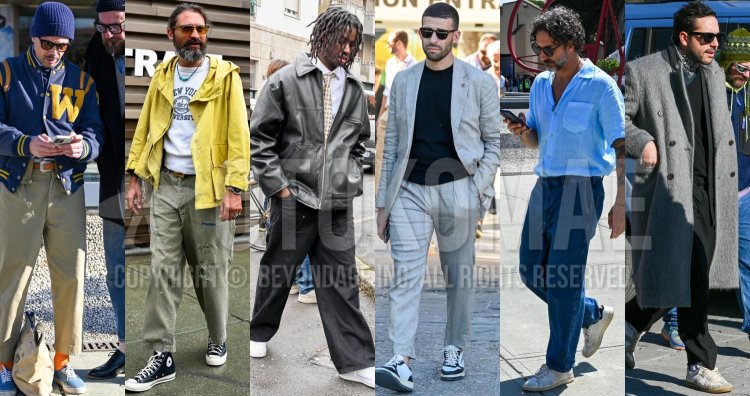
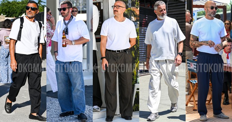
What are the tips for successful light-colored coordination?
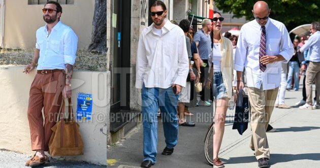
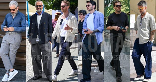
To create a successful light-colored coordinate, it is important to be aware of the importance of “sharpness. A coordinate that combines light colors throughout has a sense of unity, but the outlines tend to be blurred, resulting in a coordinate that lacks presence. For this reason, we recommend using color matching and silhouettes to create a sense of crispness. For example, use dark tones in shoes, bags, and accessories to tighten the look, or change the silhouette by tucking in the tops. By making full use of these techniques, a stylish light-colored coordinate can be achieved by avoiding the impression of being too bland.


![The basics of denim shirt coordination [ how to choose fabric, design and silhouette, examples of men’s outfits ].](https://otokomaeken.com/wp-content/uploads/2026/05/9cc2abf34f057abaa0387dadf90651ae4803bd66eff9affd349515f8a958bec3-630x331.jpg)