A pocket chief is a great way to add a touch of color to a chic jackets look. It is a powerful arranging technique that can add flair to dark-toned styling and subtly assert a distinct individuality that sets you apart from the rest. In this issue, we will focus on “color accentuation” and introduce the key points to effectively incorporate color accentuation as well as some notable examples of how to wear it!
Sponsored by
What is an accent color?
Also known as “accent color” or “emphasis color,” it is a color that is used to add spice to fashion coordination. It is one of the techniques to be consciously adopted when there is a clear objective such as “to tighten up a monotonous color scheme” or “to make the green color of an accessory stand out as an accent color.
How to incorporate “accent colors” based on hue science
Color harmony” is a concept in color science, and the use of colors in fashion and interior coordination can be categorized into “base colors,” “assorted colors,” and “accent colors” in order of the size of the area occupied. The colors used in fashion and interior coordination can be categorized as “base colors,” “assorted colors,” and “accent colors” in descending order of area. Since the “accent color” is considered to be the color with the smallest area, accounting for 5% to 10% of the total area of the entire outfit, it is preferable to use a small number of items or area in order to effectively accent or spice up the outfit. In addition, the choice of colors will be very important after careful consideration of base and assorted colors.
Elevate your coordination by controlling the impact of the accent color!
There are different types of colors, ranging from “highly effective colors” to “less effective colors. The barometer for the strength of the effect is based on the “difference in hue (relationship between opposite and complementary colors)” and the “difference in tone (difference in brightness and saturation).
Expressing a color by using the difference in brightness
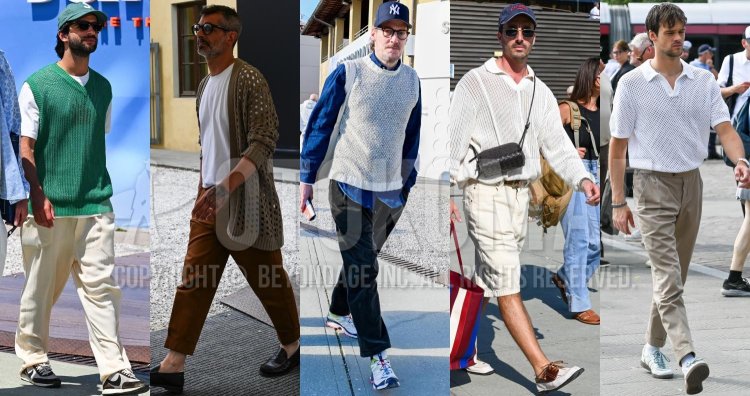
For example, matching a black item, which has the lowest brightness, with a high brightness item can be said to be a “highly effective color addition” because of the difference in brightness.
Expressing a color using the difference in hue
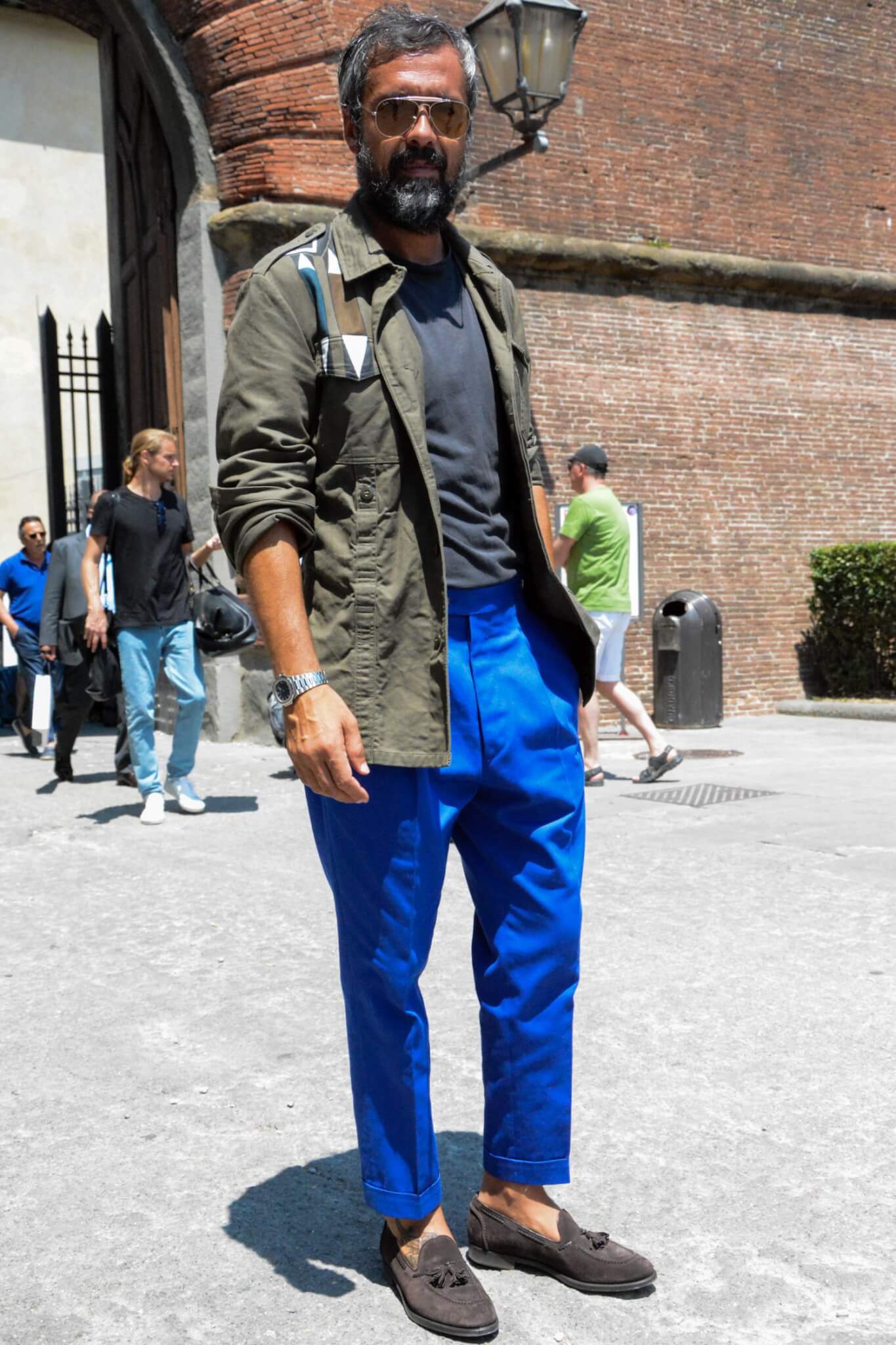
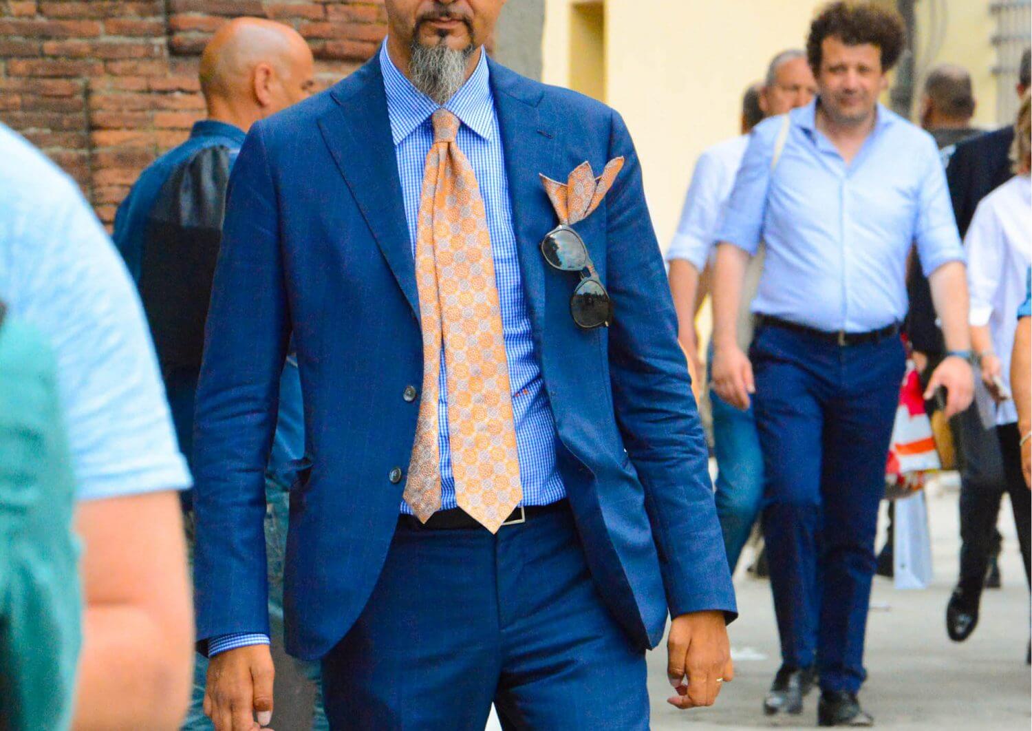
Even if the brightness is the same, if there is a difference in hue, a color can be added. For example, if the main color is blue, an orange item, which is the opposite of blue on the hue circle, can be used.
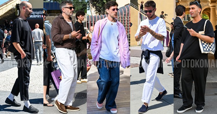
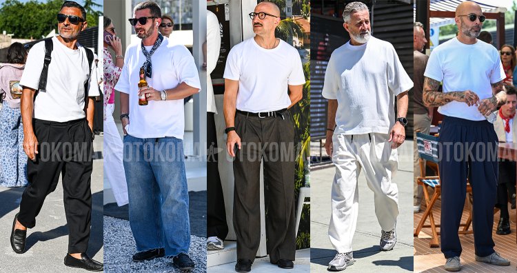
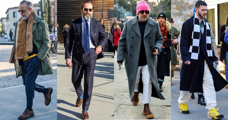
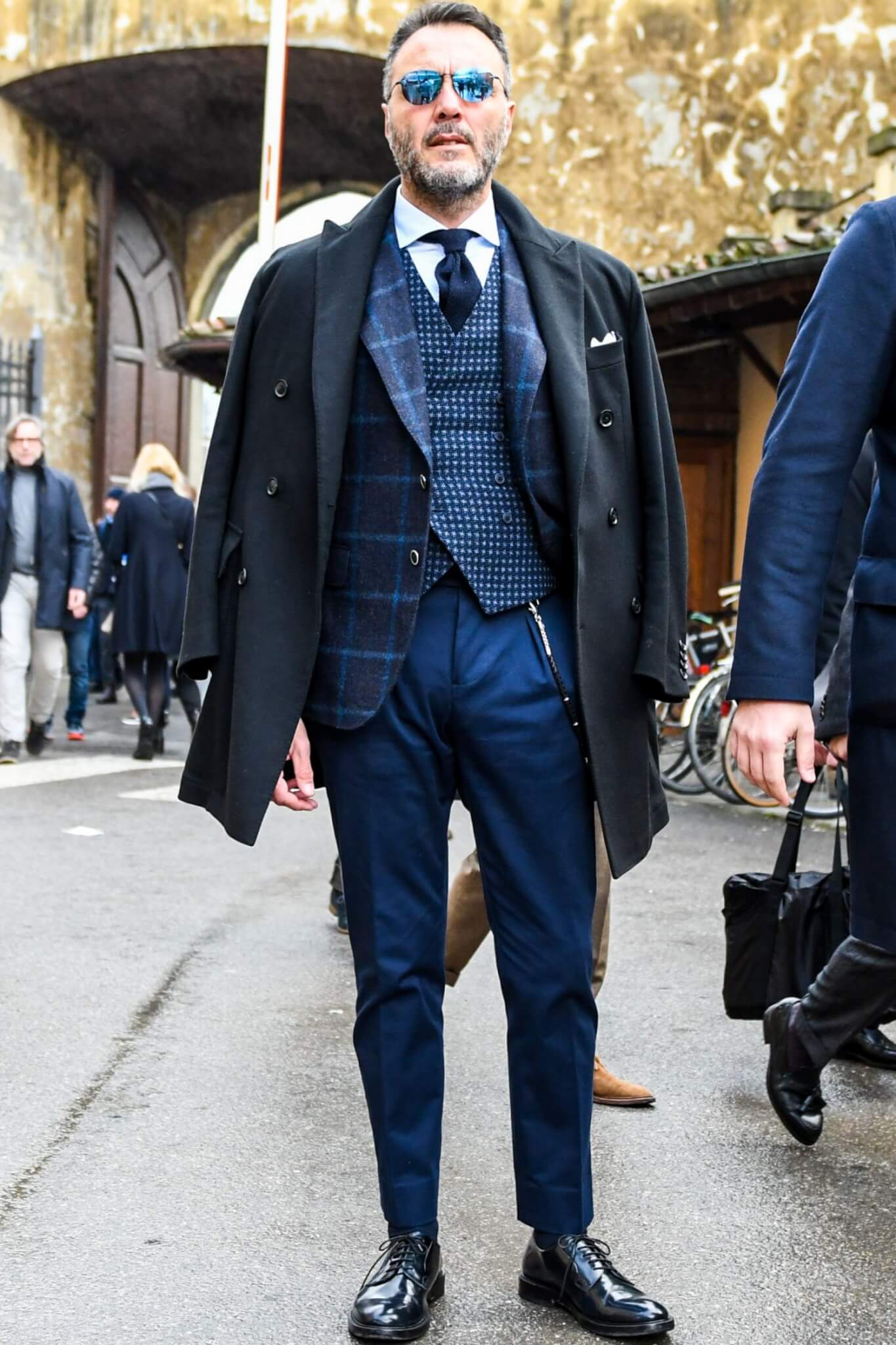
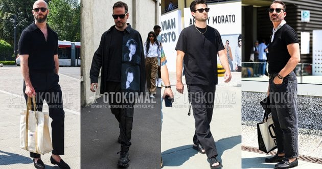
As described above, the impact of a color scheme is determined by ” the magnitude of the difference in brightness ” and ” the magnitude of the difference in hue “. Note that if the difference in brightness or hue is too small, it cannot be called a “color accent. On the other hand, as shown in the following snapshot, it is a good option to create a cohesive atmosphere by keeping the differences in brightness and hue to a minimum.
Next, we will introduce some notable outfits that specifically take advantage of the use of color!
2/22GO TO NEXT PAGE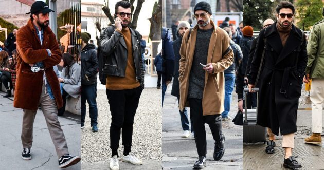
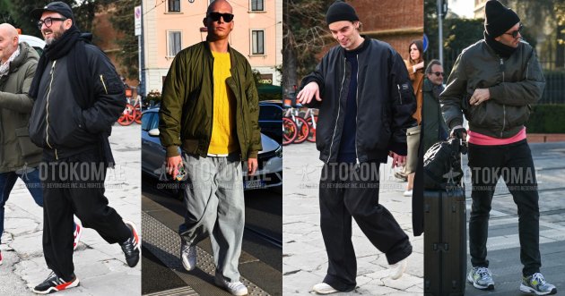
![Winter Clothes Men’s Fashion Outfit/Code Special [ 2021 Newest ].](https://otokomaeken.com/wp-content/uploads/2020/11/0e76d0f529d4d0ebaf955ba85cb89e42-630x331.jpg)
![Winter Cordage Men’s Special [ 8 Ideas for a Stylish Look ].](https://otokomaeken.com/wp-content/uploads/2017/12/dc8035ad2e6fa6b1da73d548cd2844e7-630x331.jpg)
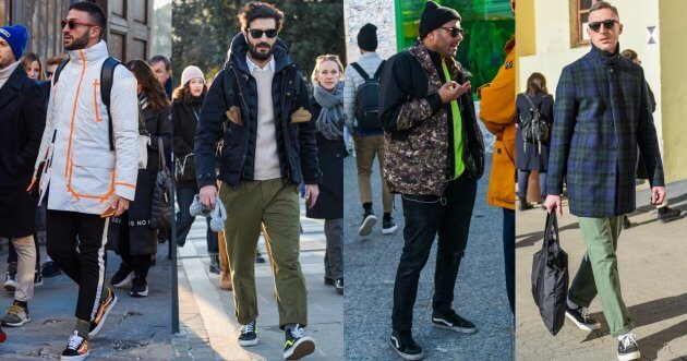
![Winter Cordage Men’s Special [ 7 Styles of Chester Coat Wear ].](https://otokomaeken.com/wp-content/uploads/2018/01/3256-630x331.jpg)

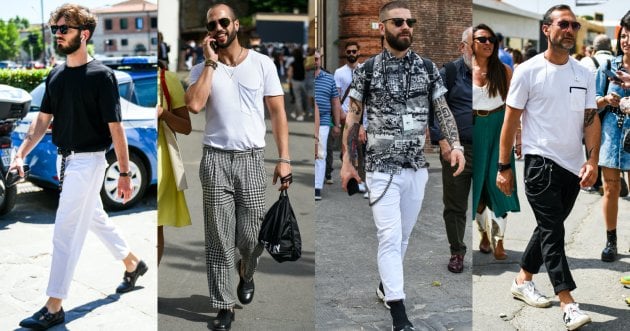
![The Complete Guide to Chinos [ History, tips on how to wear chinos, international snapshots, and recommended models all in one place ].](https://otokomaeken.com/wp-content/uploads/2025/08/fc6927a4cd7fc6f068de9eb5d3ae4aff-4-630x331.jpg)