It is no exaggeration to say that “earth colors” are indispensable in the construction of modern men’s fashion. While they are familiar colors found in the natural world, their familiarity also has the danger of turning into a negative impression of “plain” or “drab” if one step is taken wrongly. In this issue, we introduce the history of earth colors in fashion, as well as examples of typical color coordination!
Sponsored by
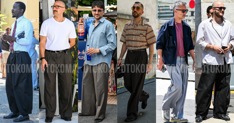
Nowadays, it is an essential part of men's fashion!What are earth colors?
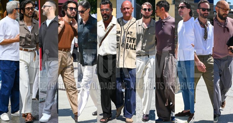
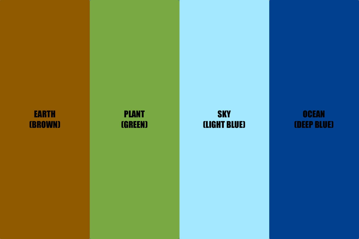
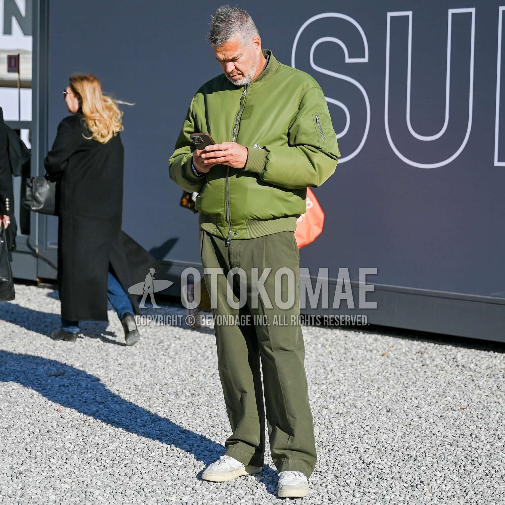
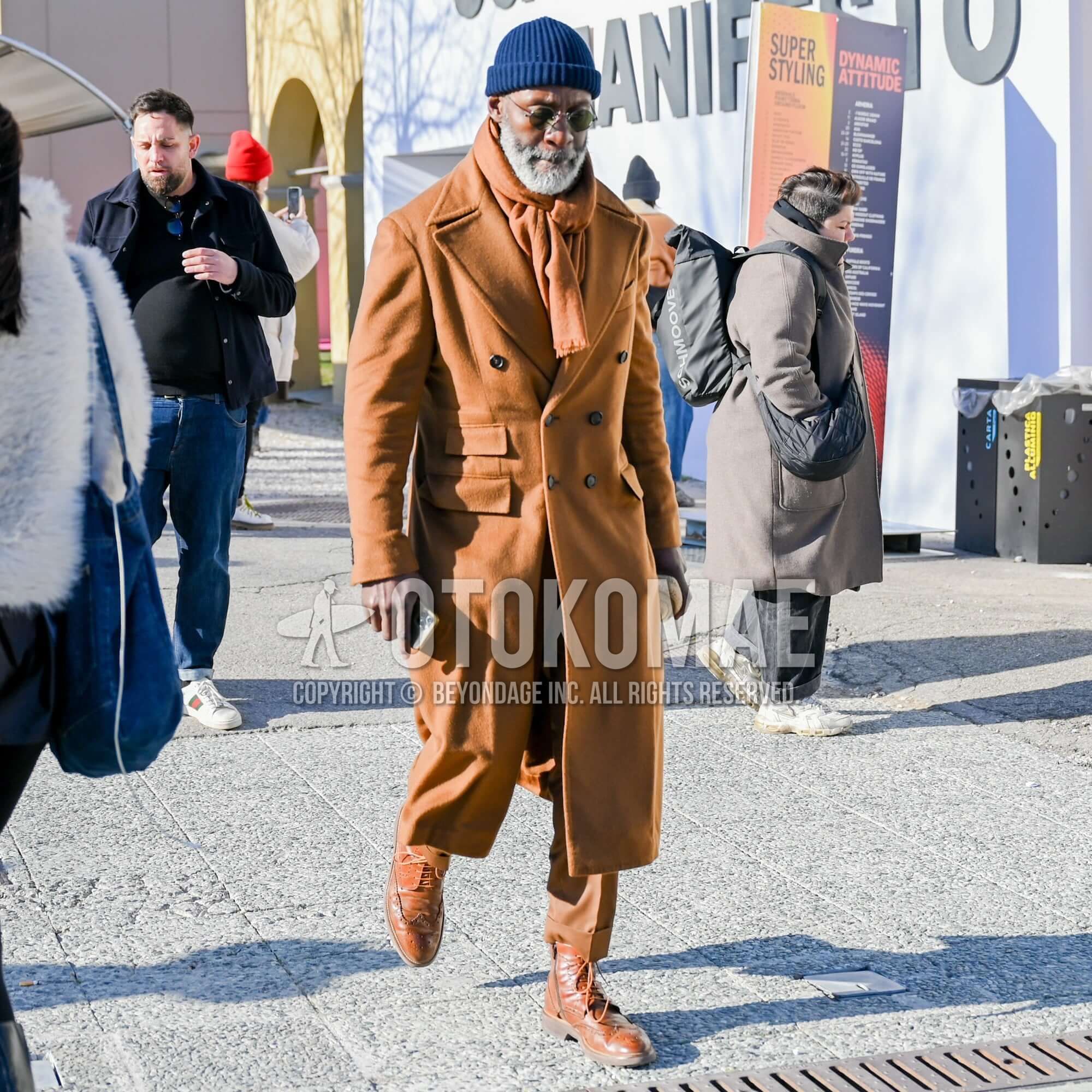
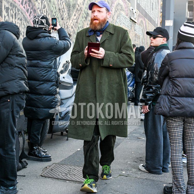
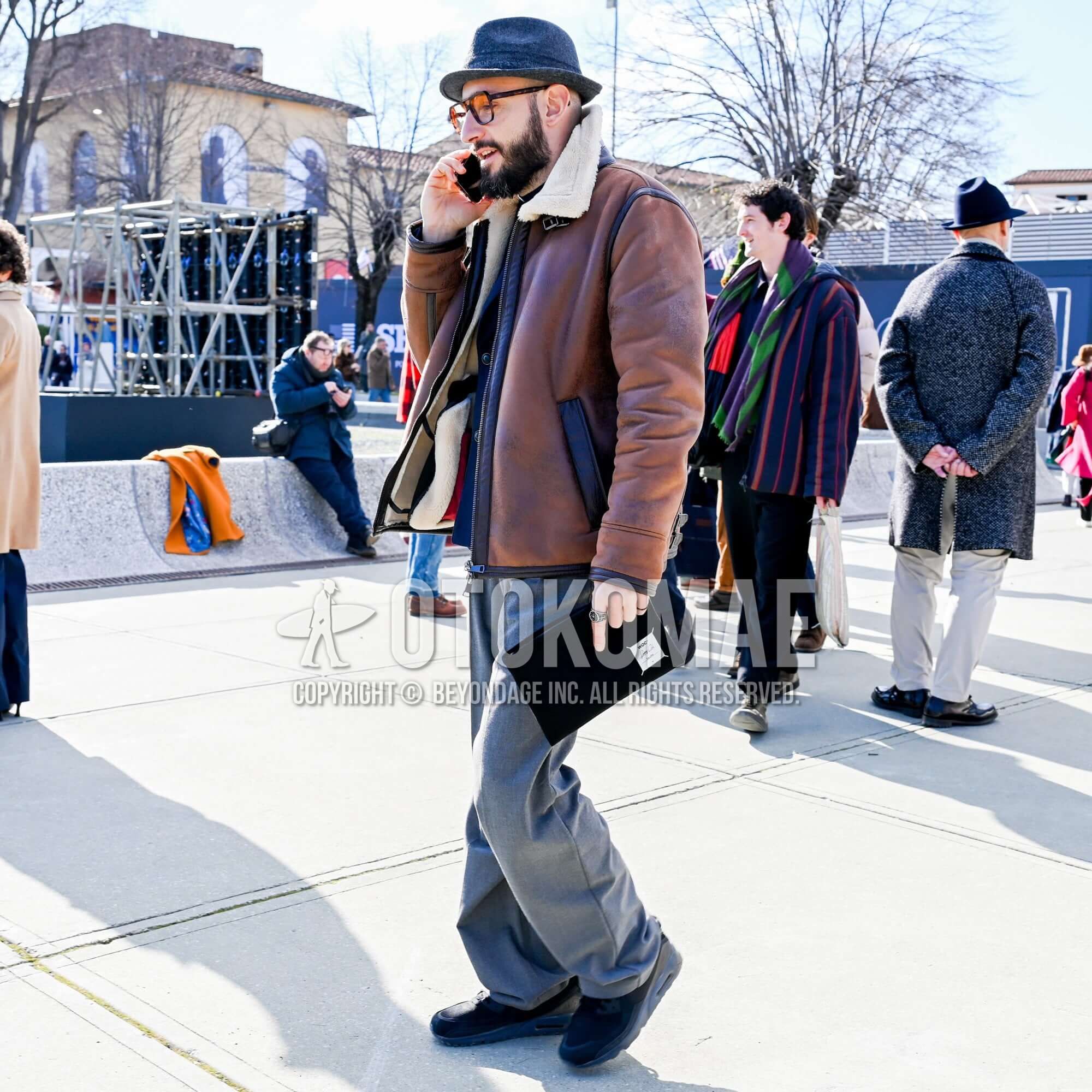
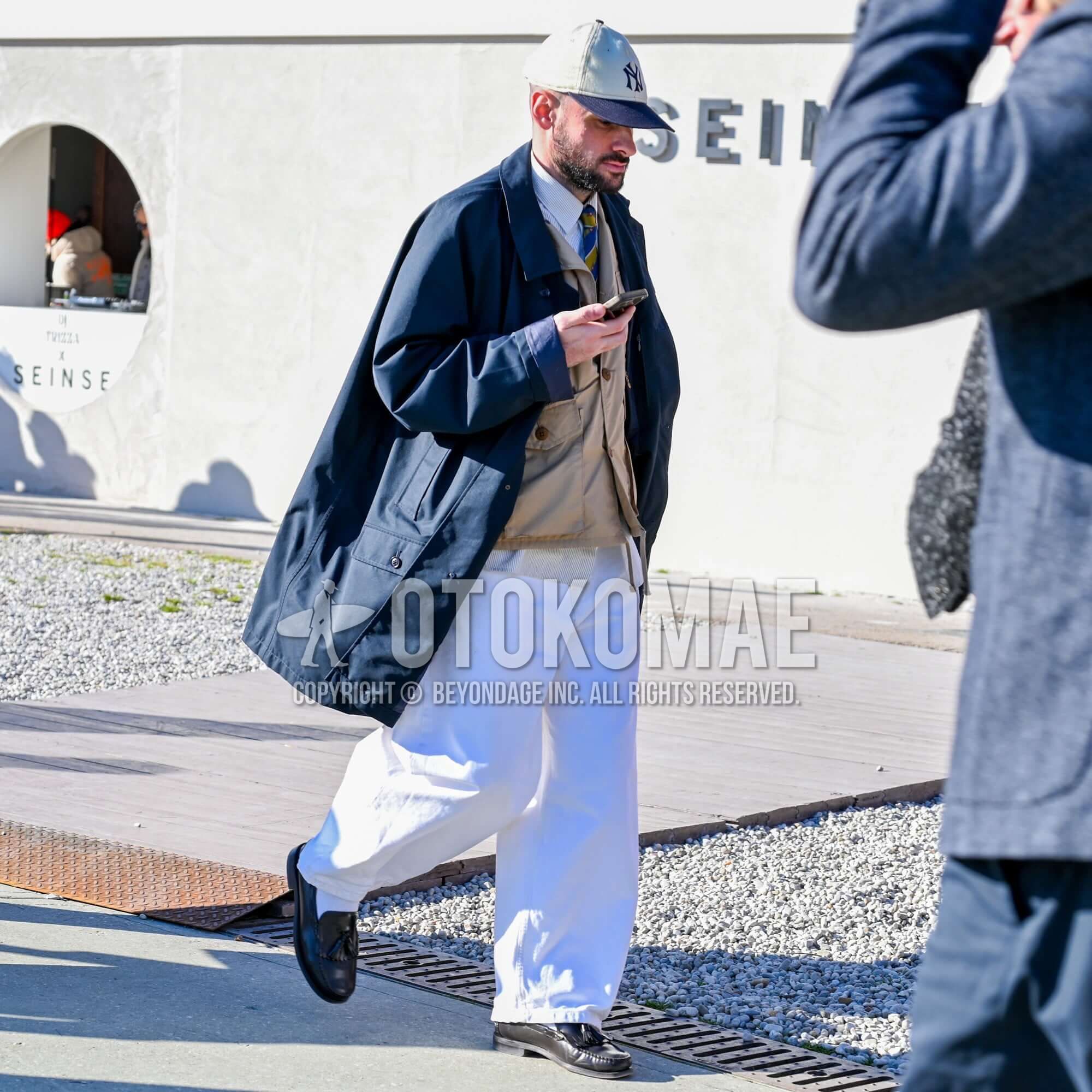
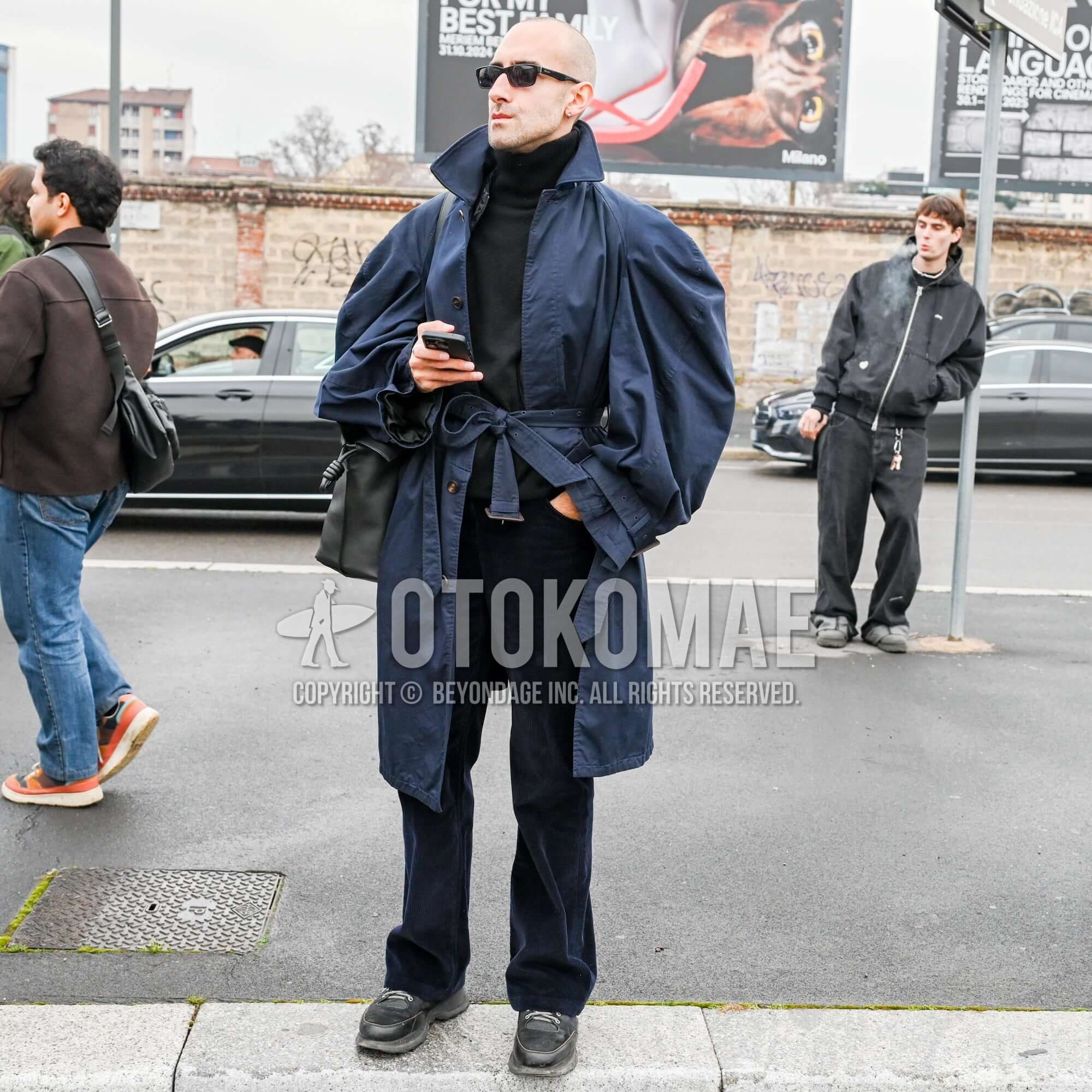
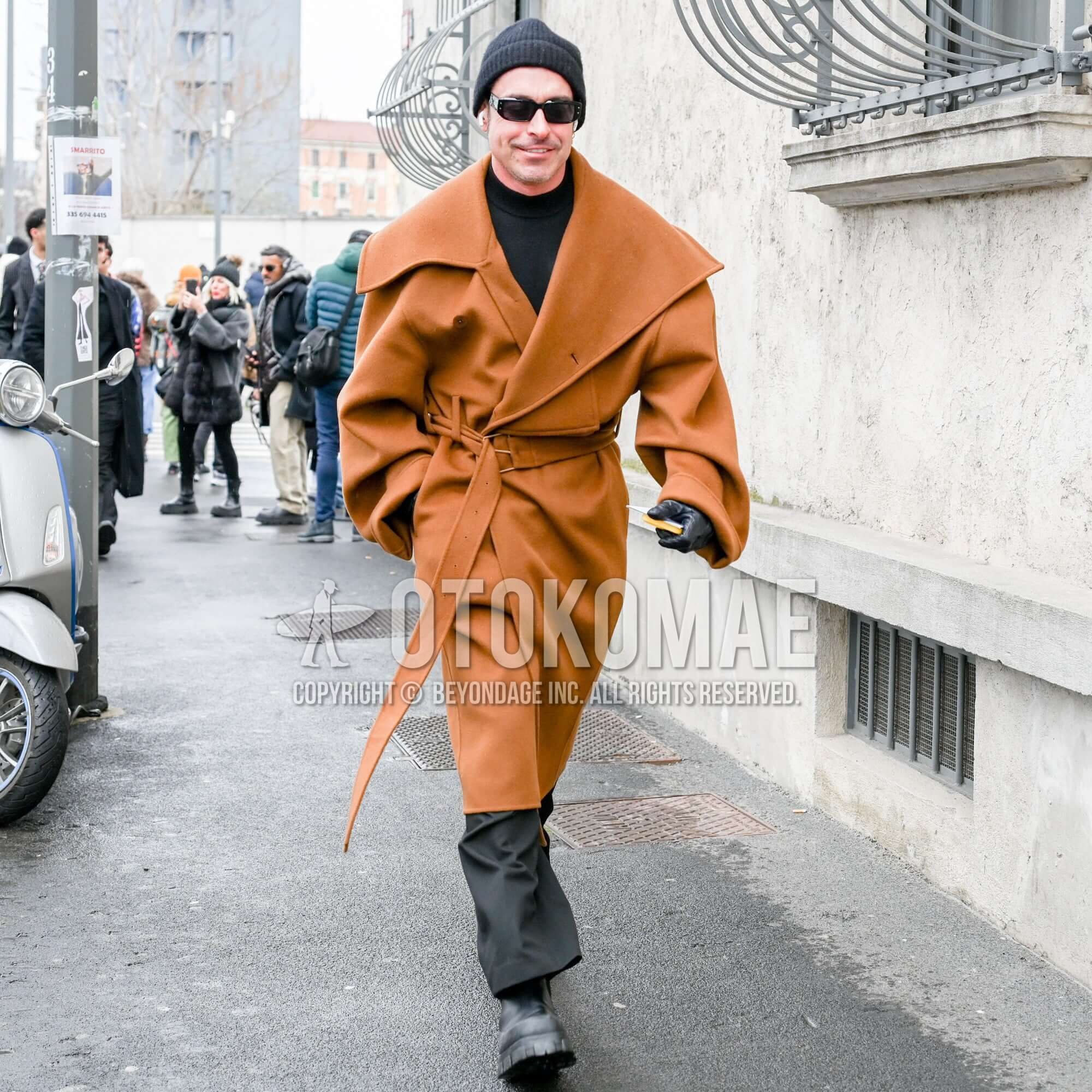
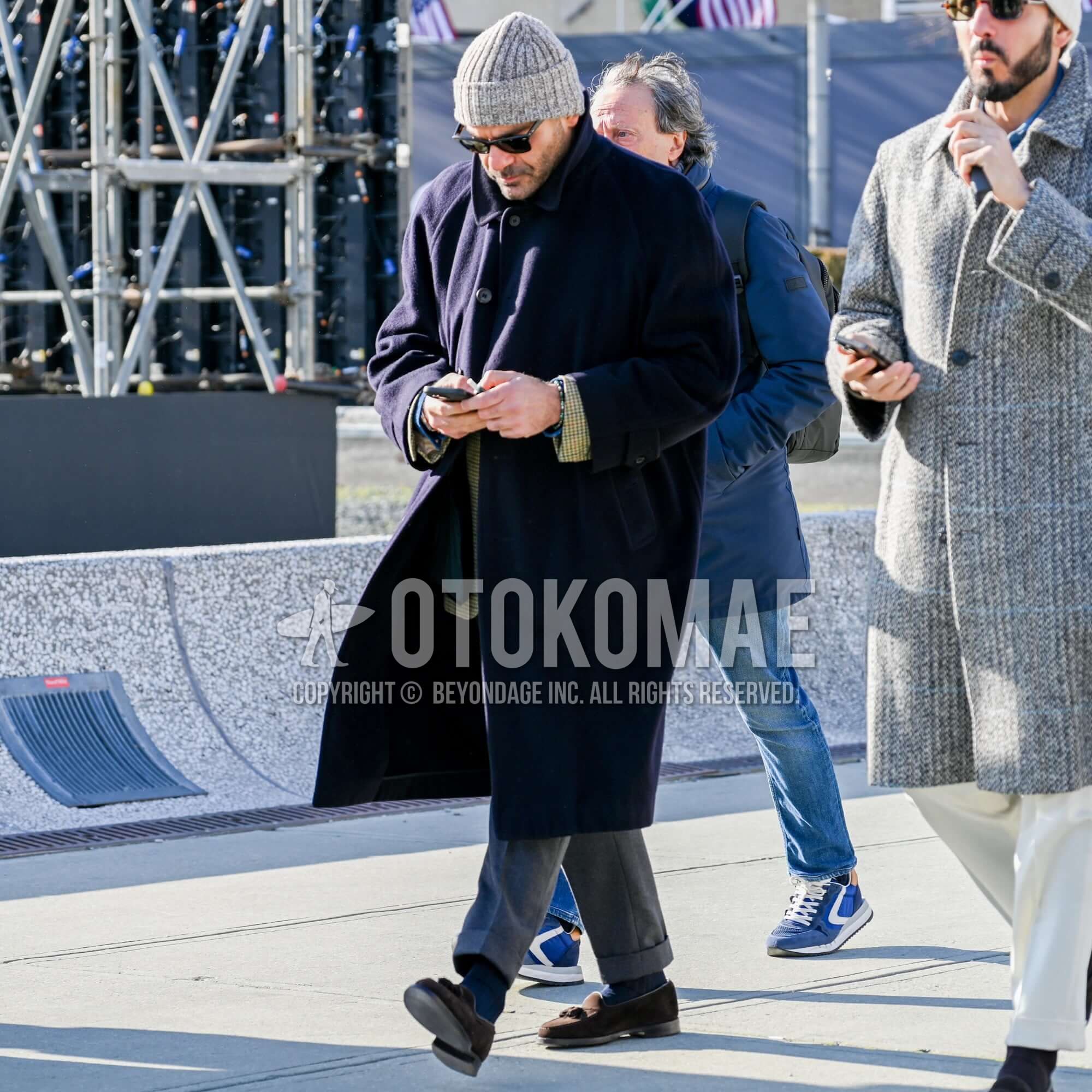
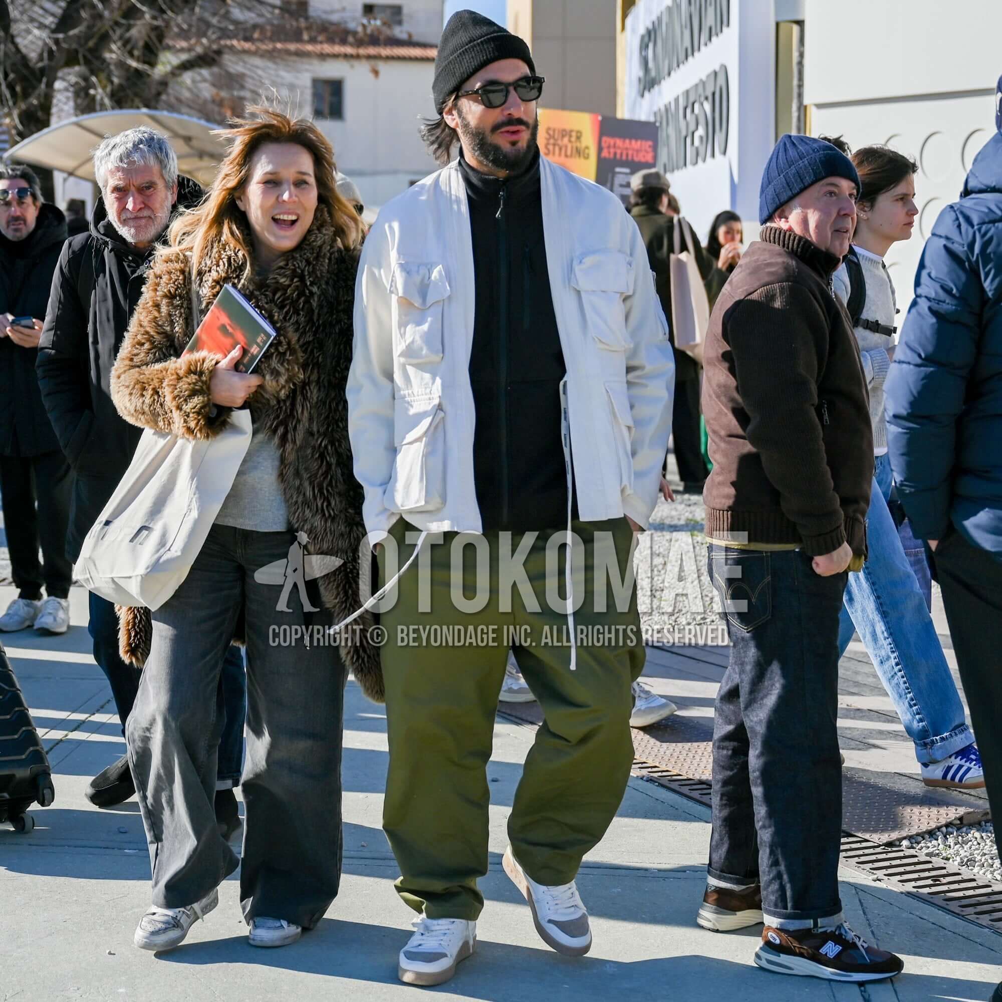
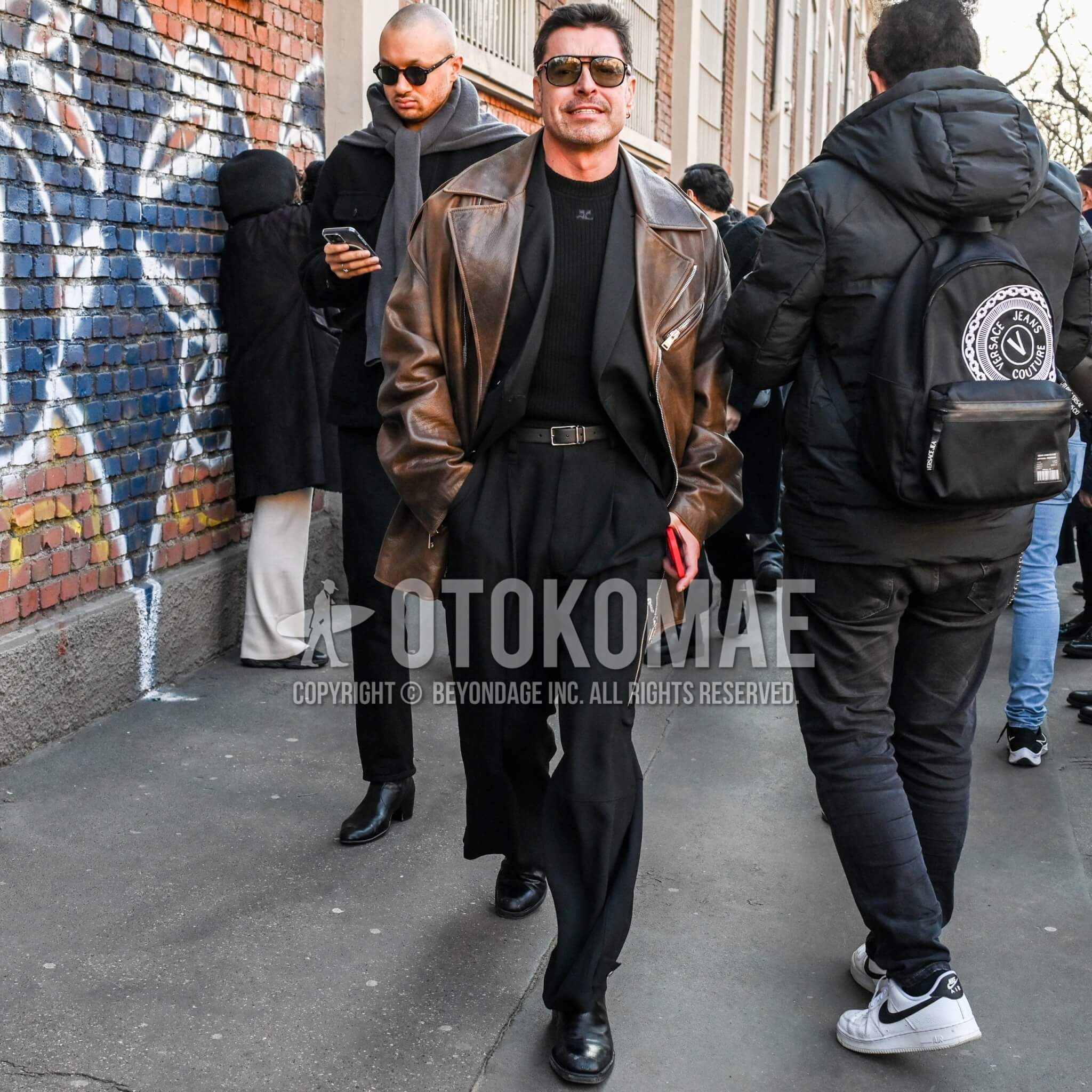
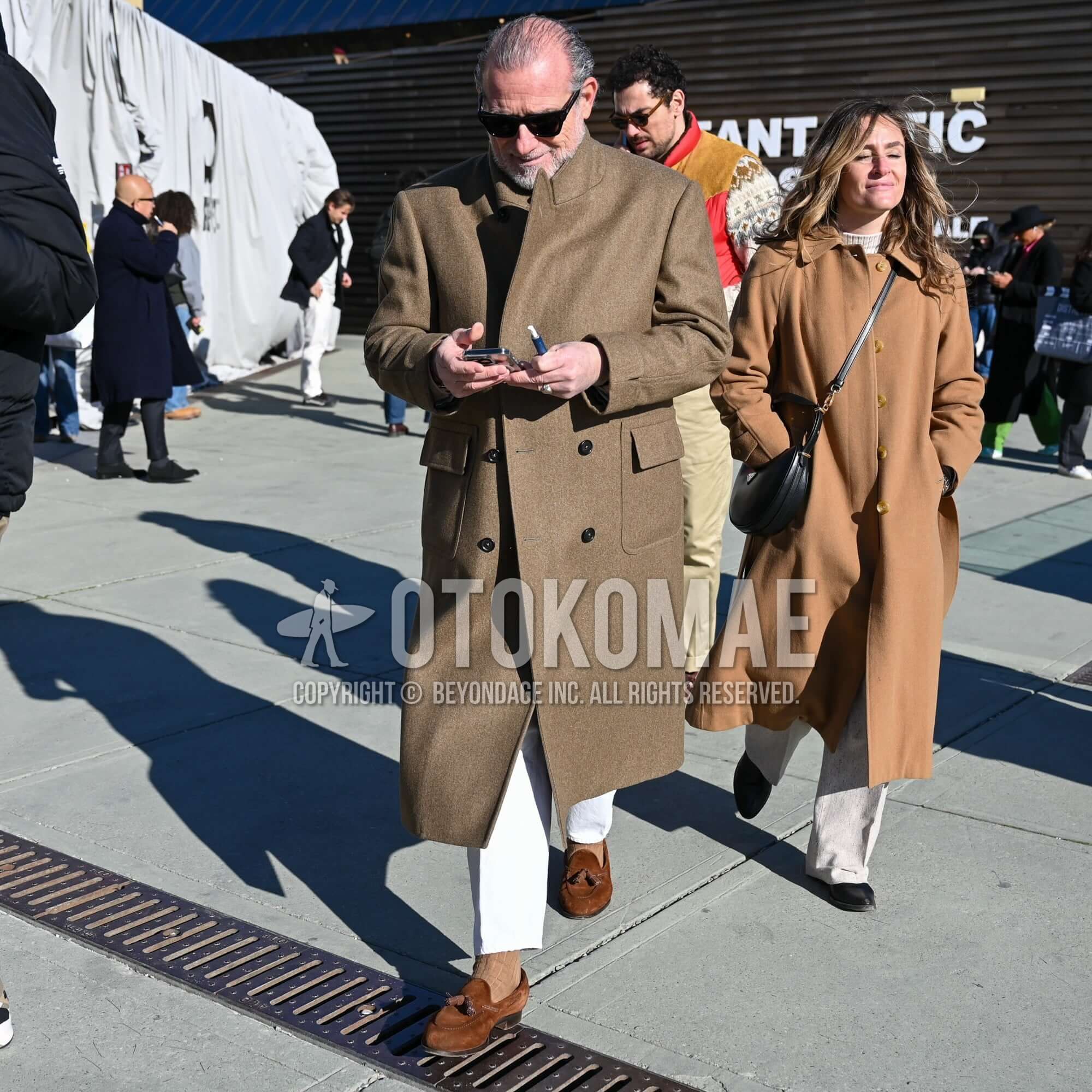
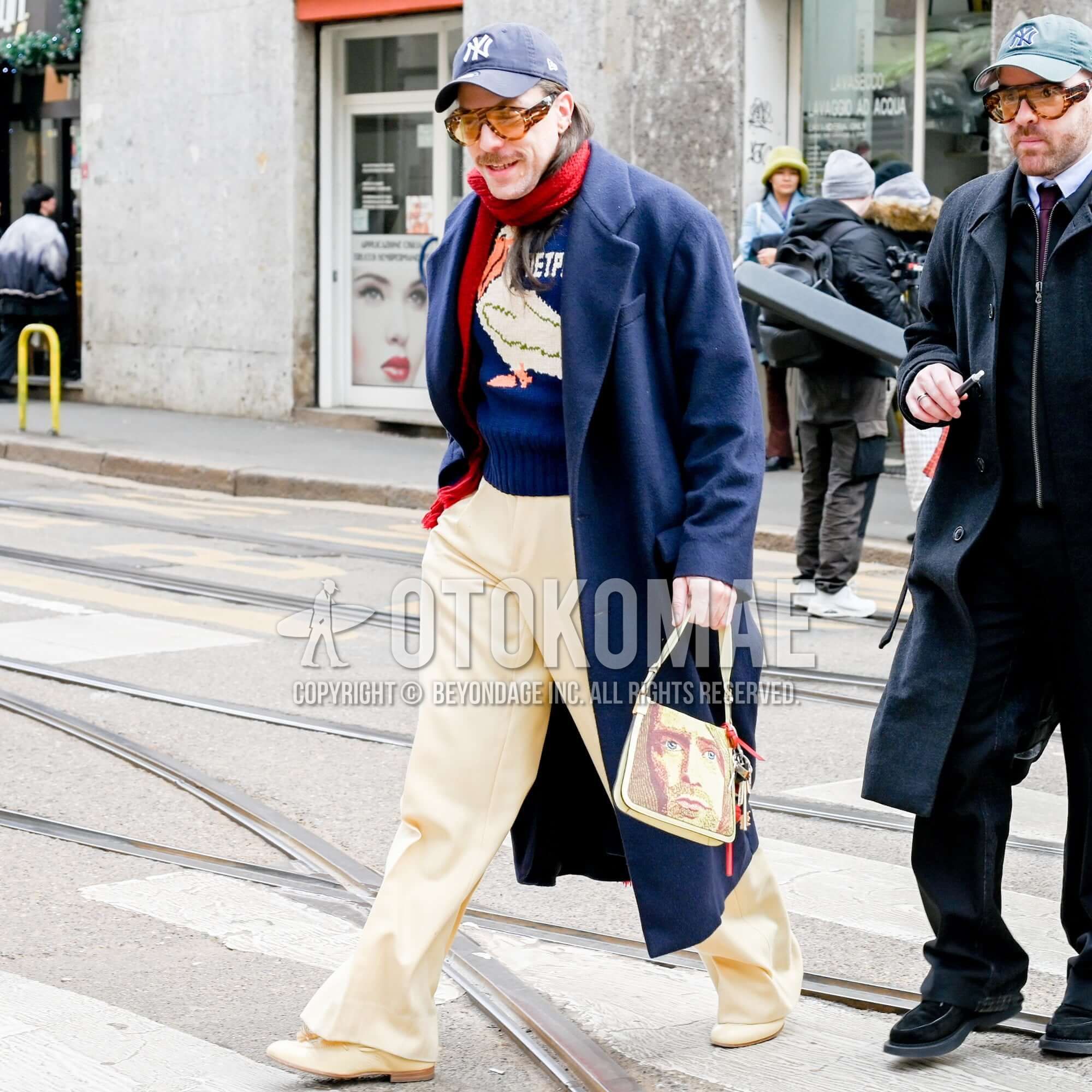
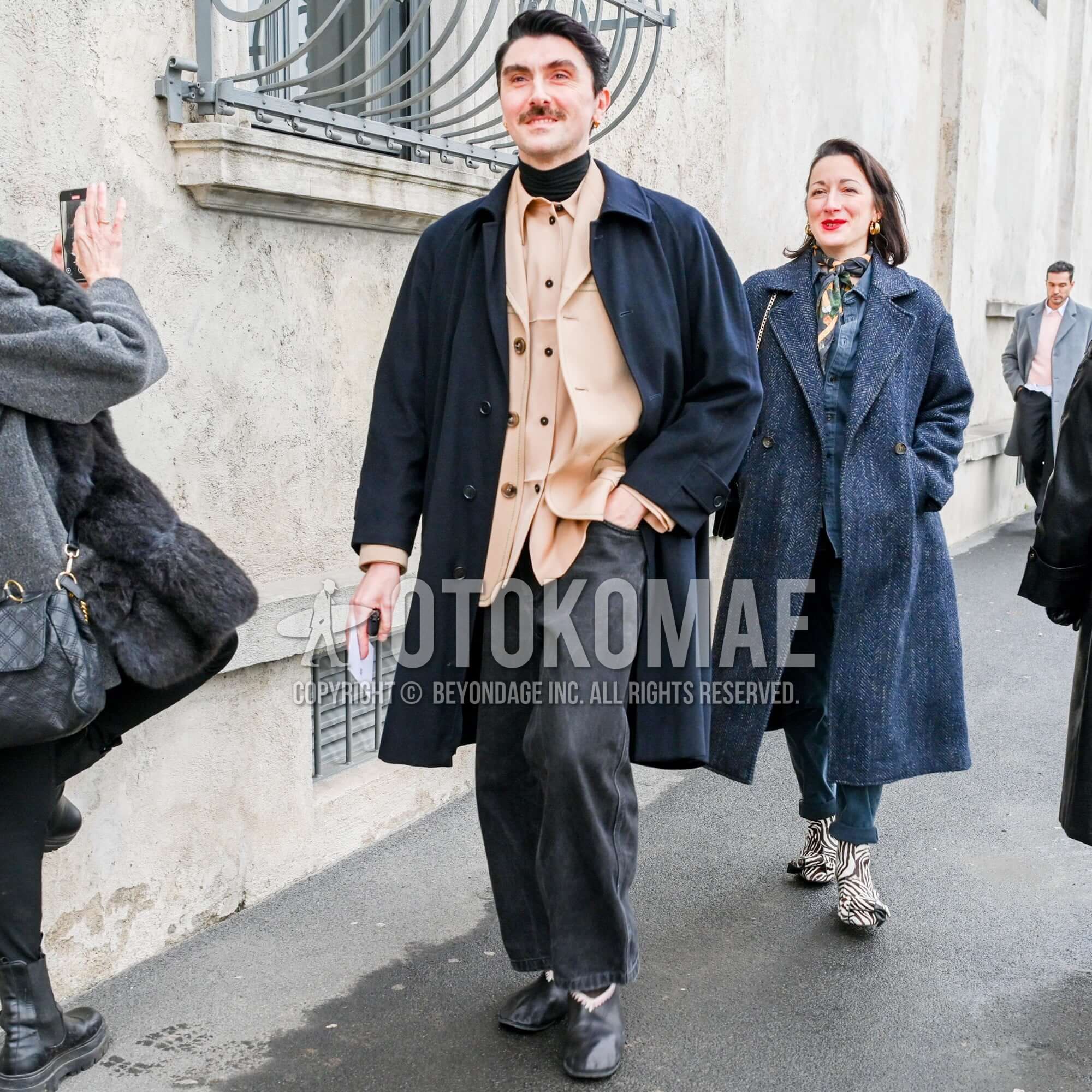
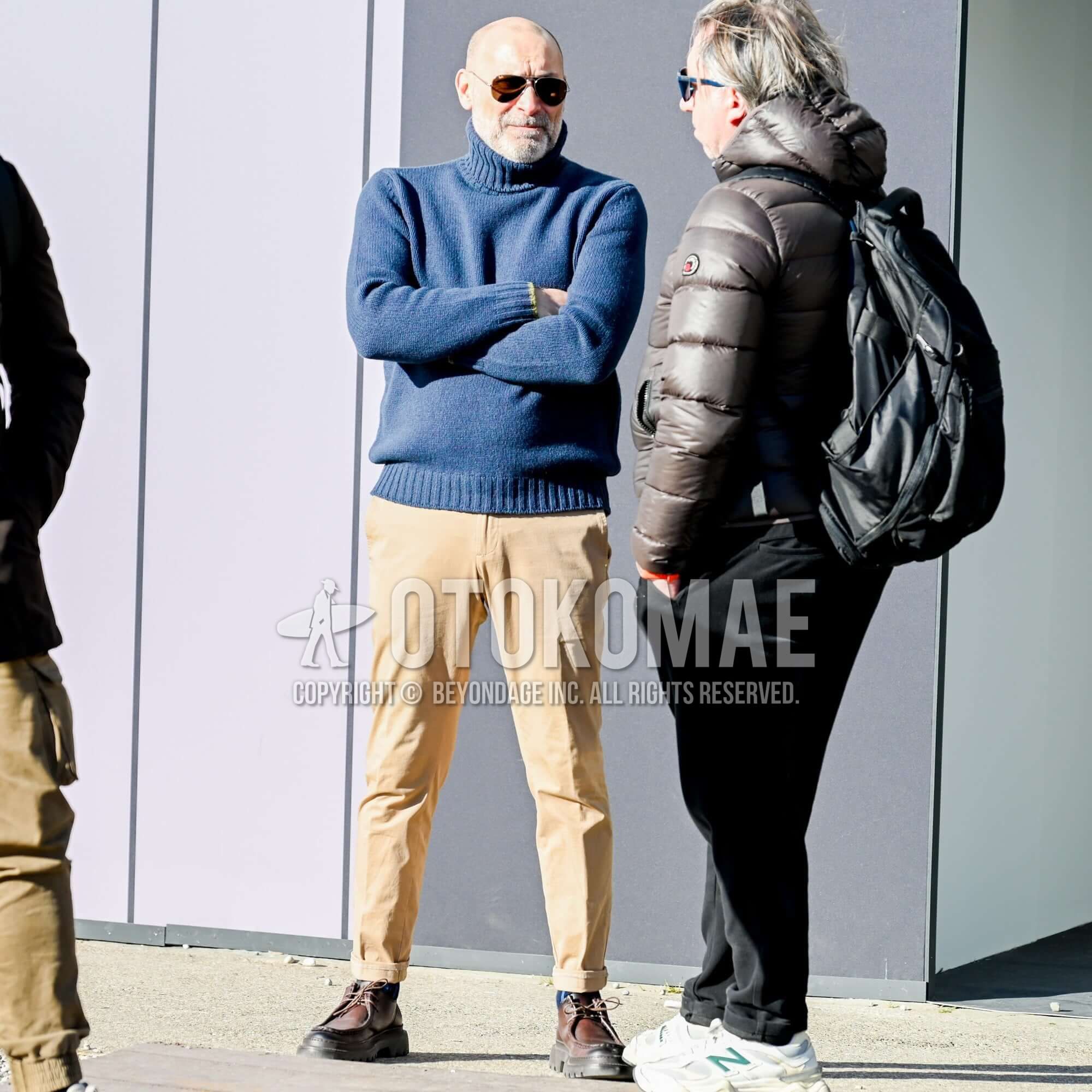
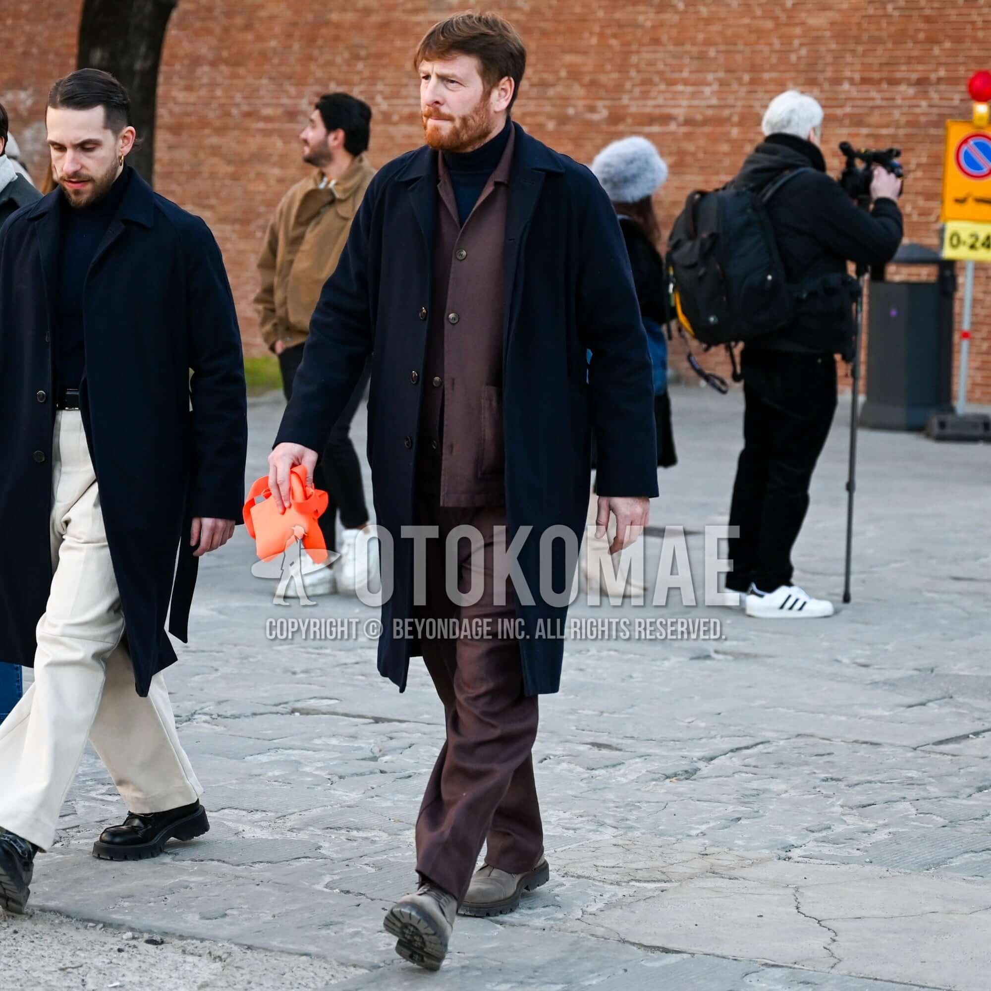
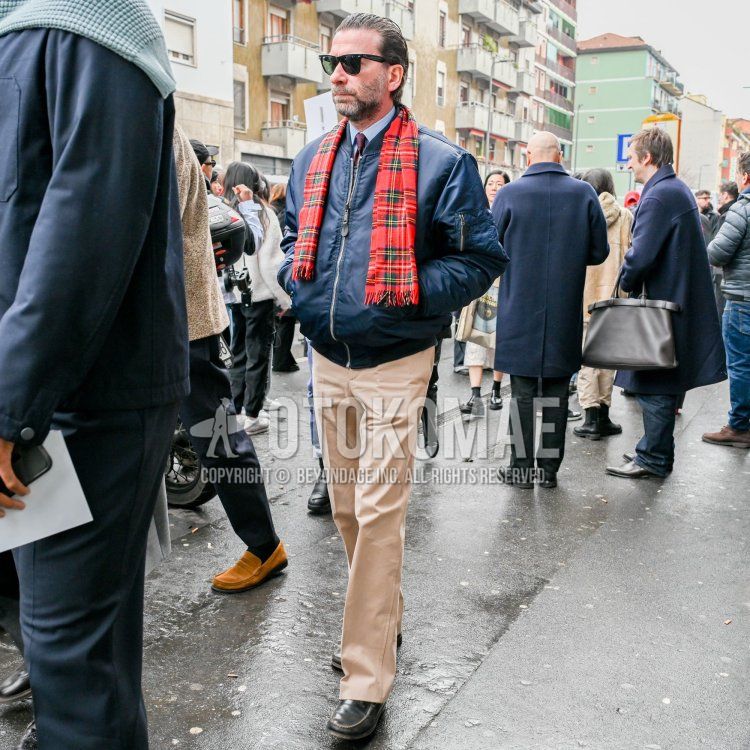
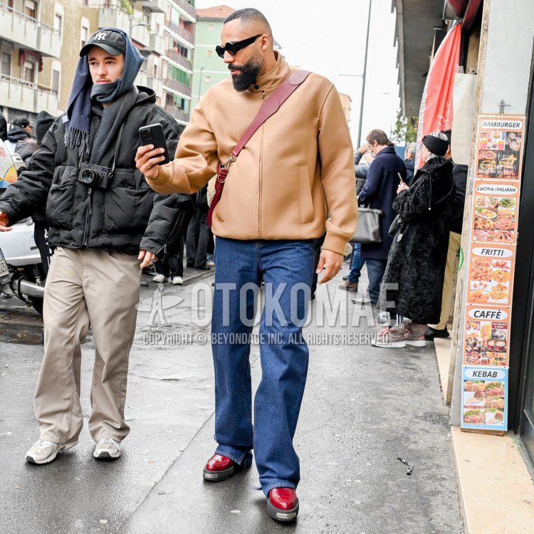
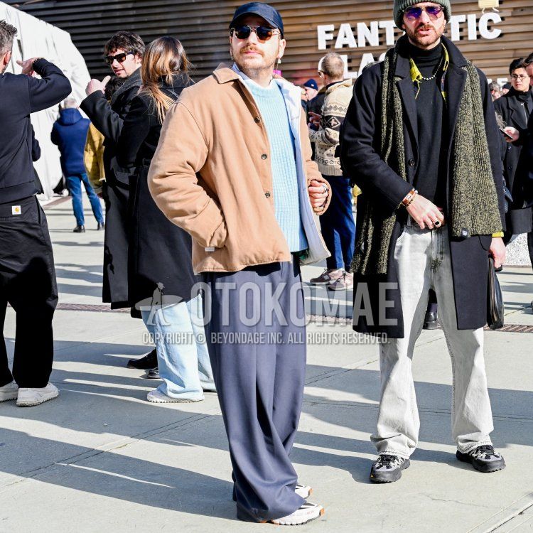
Earth colors are directly translated as ” the colors of the earth. In other words, they are colors found in nature, such as earth, sky, sea, and plants in the earth’s natural world. Specifically, beige, brown, green, and blue. They are browns, greens, and blues, and are often less saturated and more subdued in tone than pastels and vivid colors. One of the reasons for their popularity is that they go well with basic fashion colors such as white, black, gray, and navy, and are easy to incorporate into everyday coordinates.
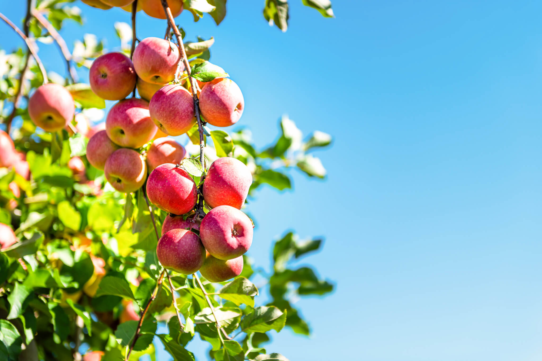
There are also flashy colors in nature.Why are flashy colors such as fruits not included in earth colors?
When we say “colors in nature,” doesn’t that include things like red apples and yellow grapefruits? Some might think so. If you think of them simply as colors, yes, but they do not fit in with the colors of the natural world and are very “alien and conspicuous. It is said that the flashy colors, especially in fruits, are used to make it easier for animals to find the seeds so that they can flourish (animals eat the fruit and carry the seeds to faraway places). Earth colors in fashion and interior design refer to “hypoallergenic, non-boring colors” and are background colors that occupy the majority of the field of vision in nature. In other words, flashy colors such as singular fruits are accent colors in fashion. For these reasons, colors such as brown, beige, green, and navy are mainly used in earth color coordination.
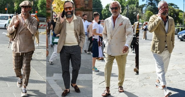
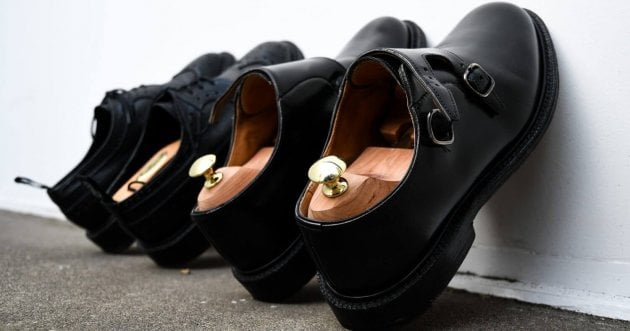
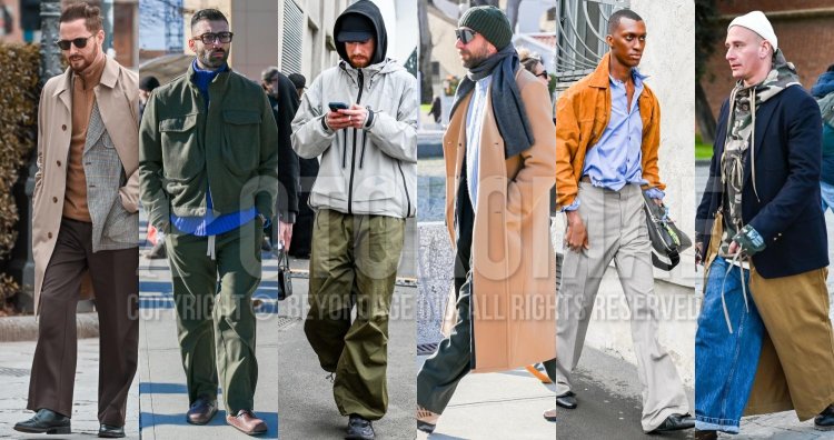
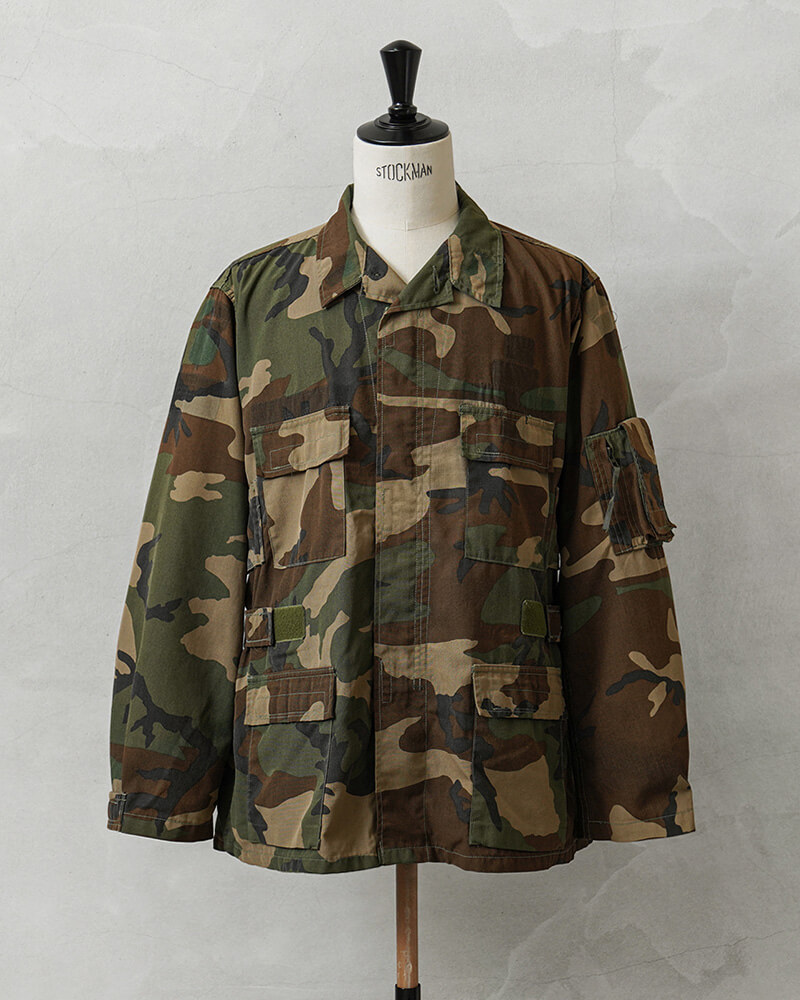
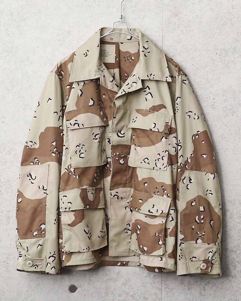
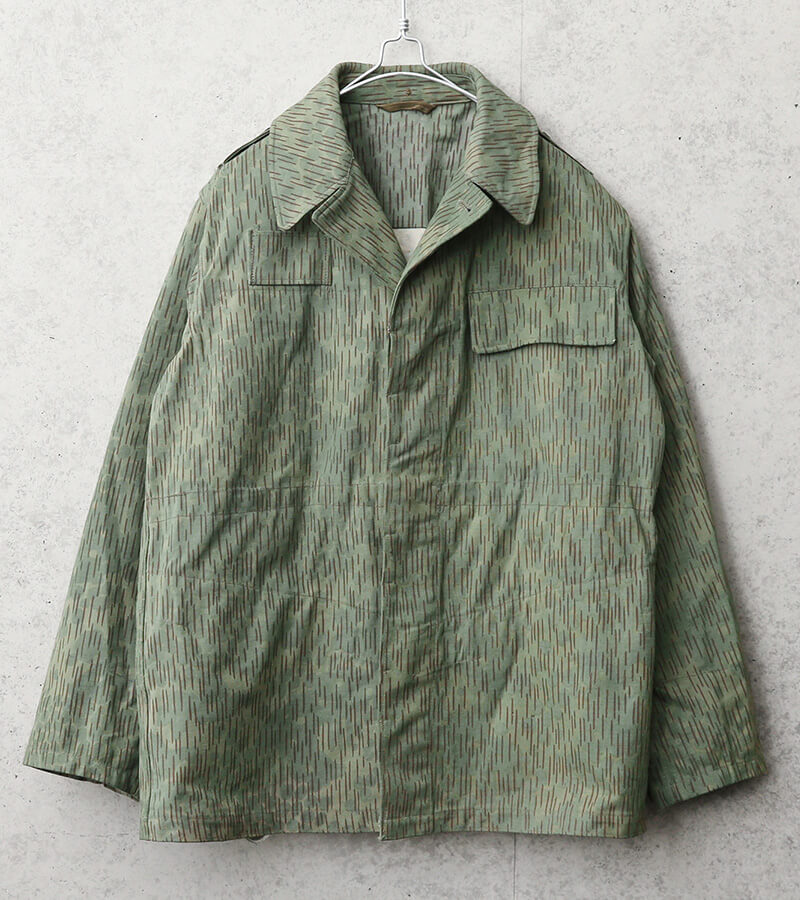
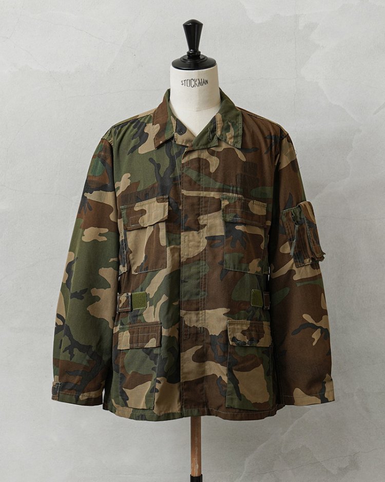
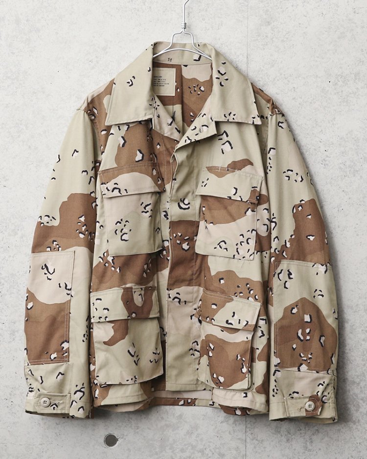
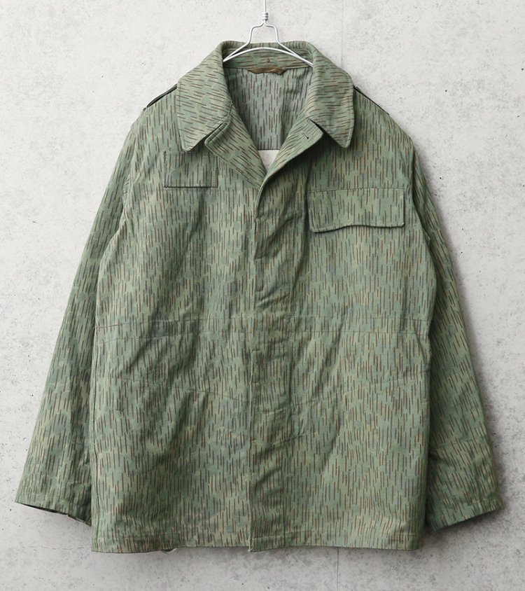
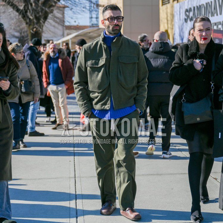
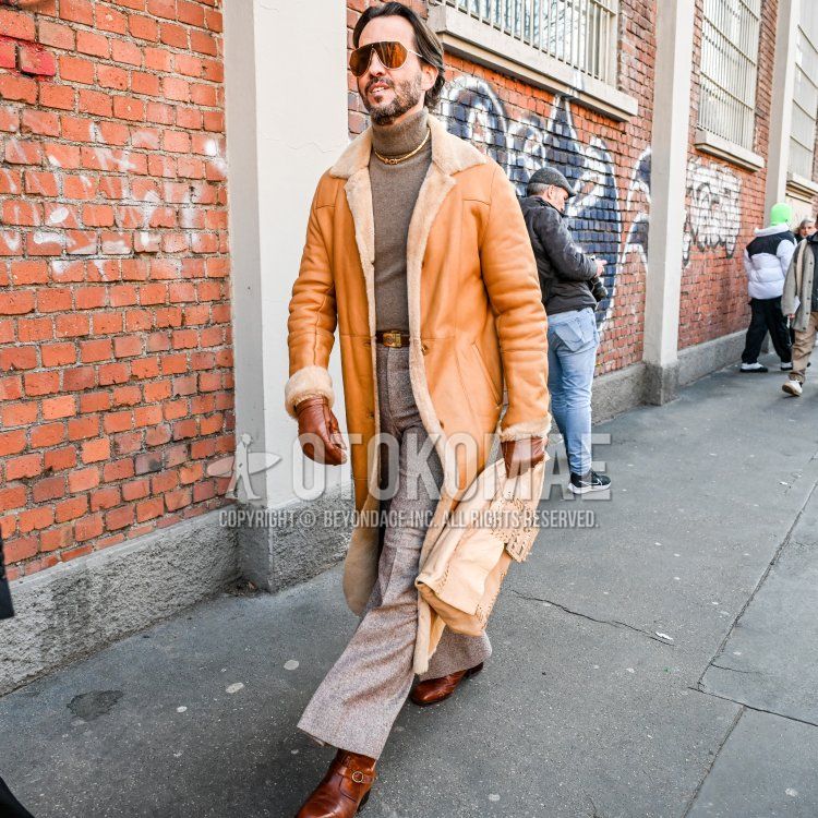
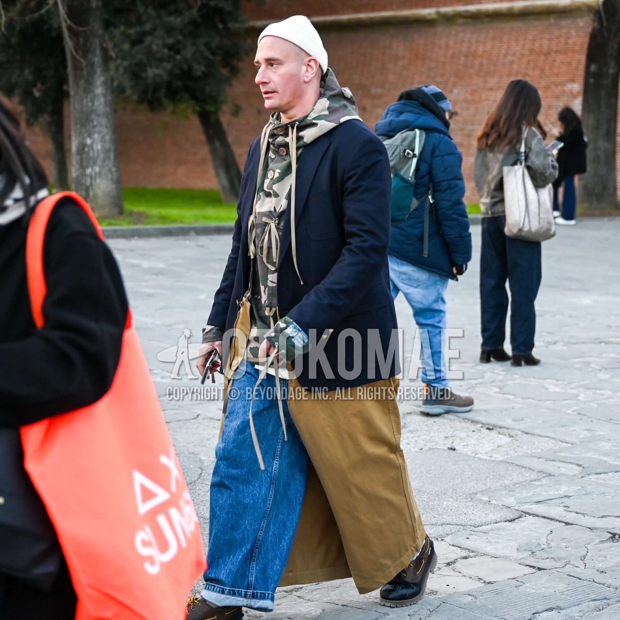
Why earth colors have spread in the fashion world 1Military wear with camouflage patterns for blending in with nature has taken hold in the populace
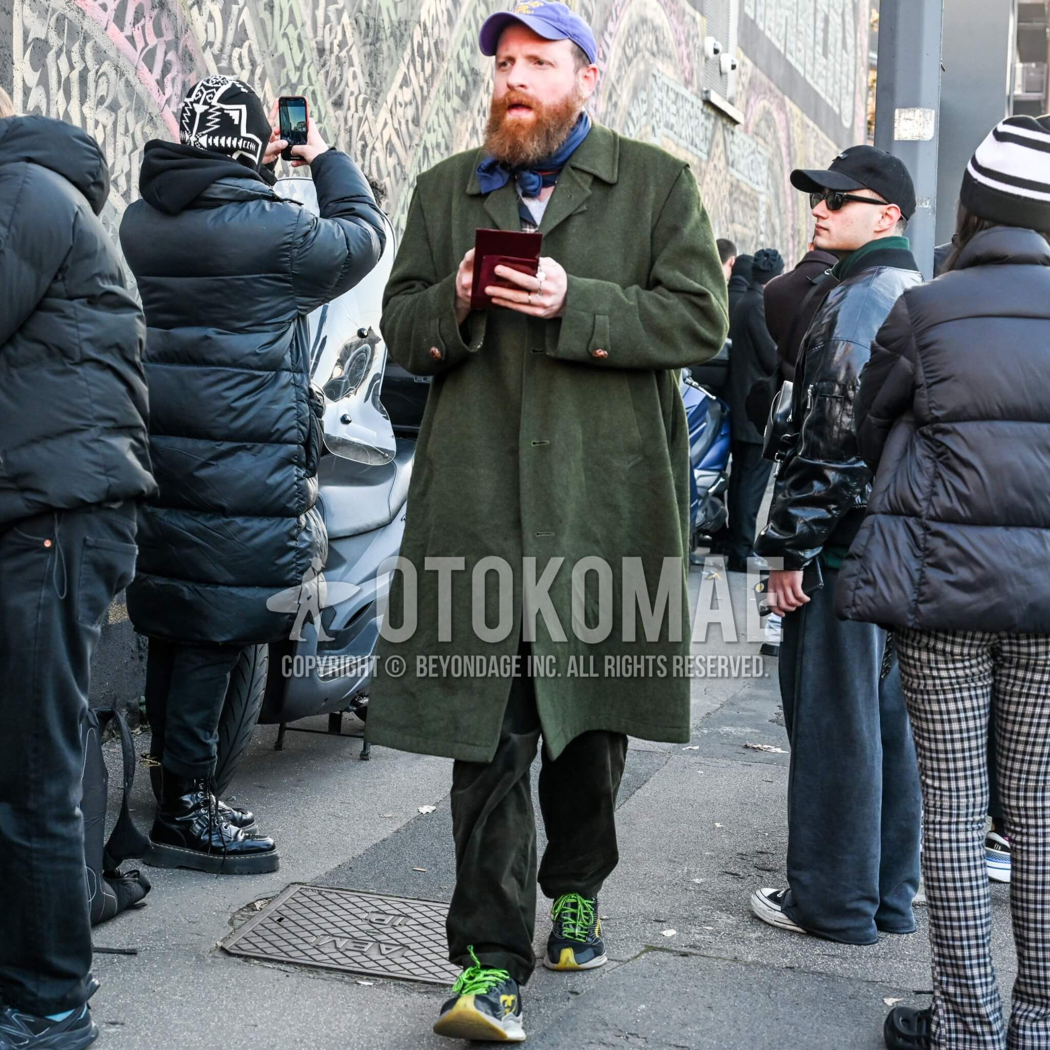
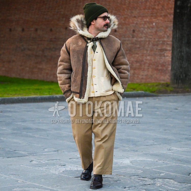
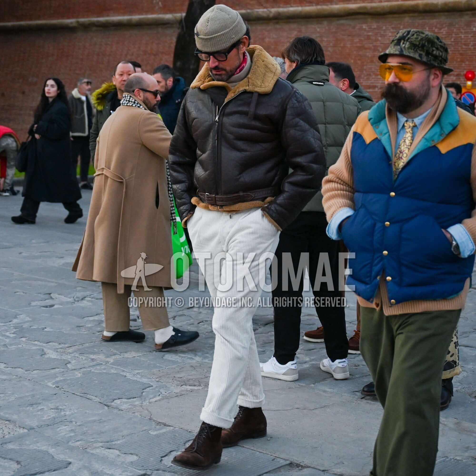
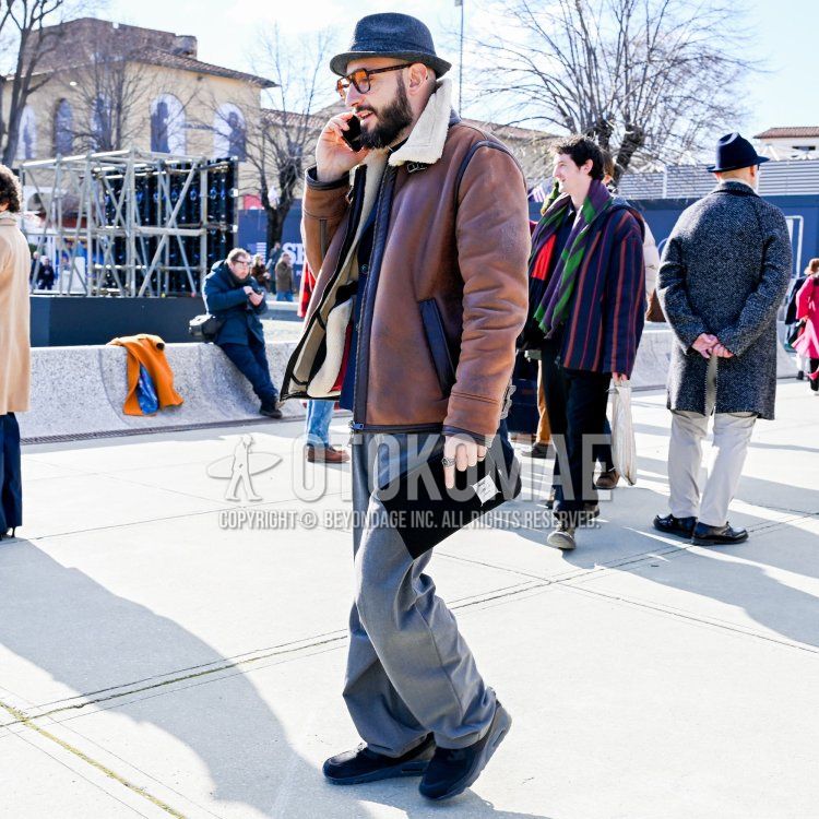
The most obvious earth colors in fashion are military colors, where camouflage colors are used. Military wear, which is often based on olive green, brown, and beige, is intended to blend in with the colors of nature and make it difficult to be detected by the enemy. The typical woodland camo pattern is designed for combat in forested areas, but other camouflage patterns, such as chocolate chip camo for desert and wilderness combat and rain drop camo for blending in with coniferous forests, are made in colors suitable for each field. Such military uniforms were disposed of to the private sector in various countries as released goods, spreading as everyday wear for the people and establishing a firm position as a fashion item. In this context, it can be said that the establishment of earth colors in fashion is largely due to military wear.


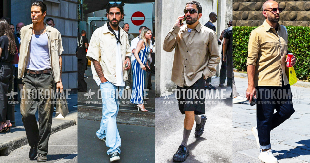
Why earth colors have spread to the fashion world2Hippie culture's anti-war irony and advocacy of return to nature are fashion trends to
Another major movement for earth colors in fashion is the idea of hippie culture. The hippies who opposed the Vietnam War advocated a return to nature as part of their movement against material civilization, and they clad themselves in clothing made of untreated cotton (raw), wool, and cloth dyed with vegetable dyes. For them, gaudy colors were reminiscent of artificial processing, while earthy browns and faded greens reminiscent of plants were truly human colors.
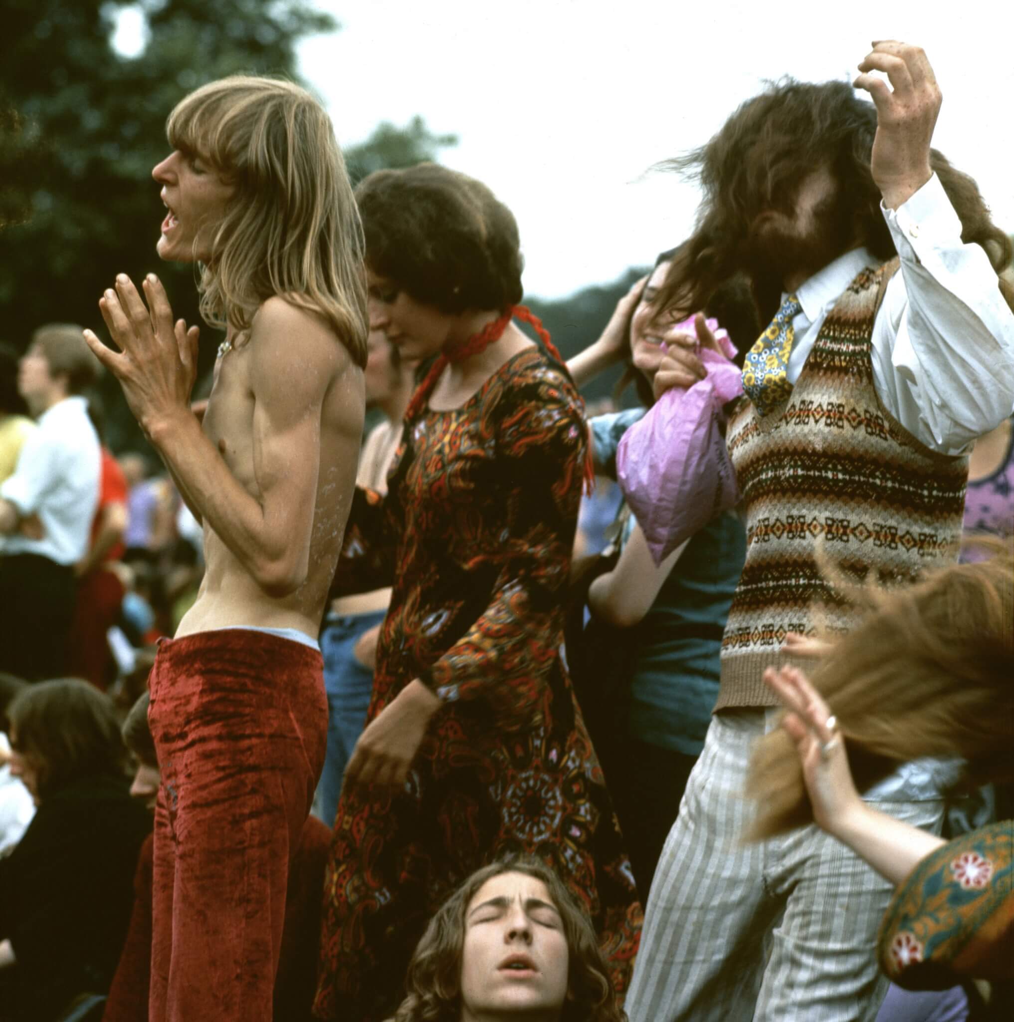
Photo by Ron Reid/Camera Press/Afro
In addition to the fact that the military colors mentioned in the previous section were the colors of nature as described by these hippies, they dared to wear them as fashion by adding embellishments through patches and embroidery to military releases that were available at low prices as an anti-war irony. The “colors for war” were overwritten as “peace- and nature-loving colors. Since hippie culture was a subculture of young people, earth colors are recognized as one of the trend colors in the history of fashion.
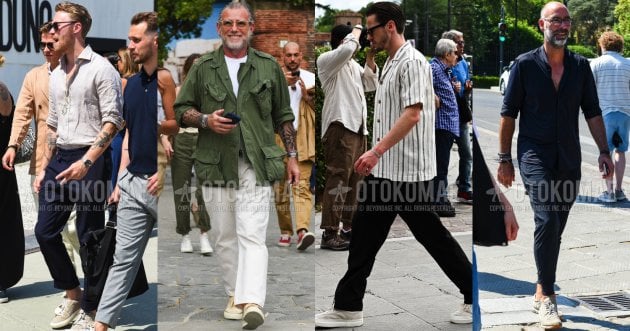
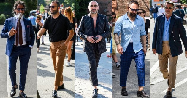
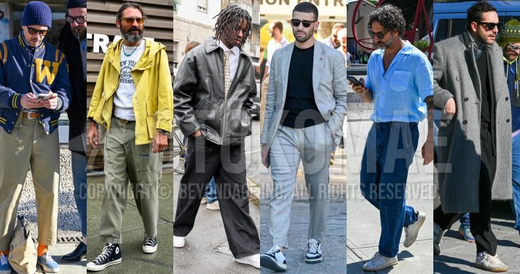
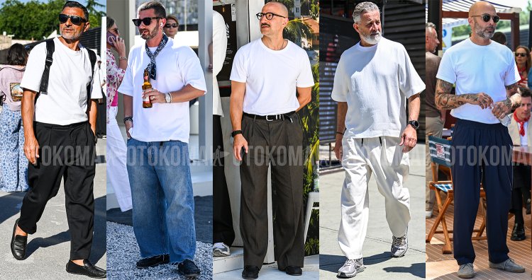
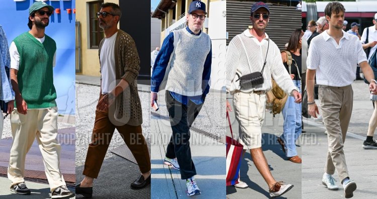
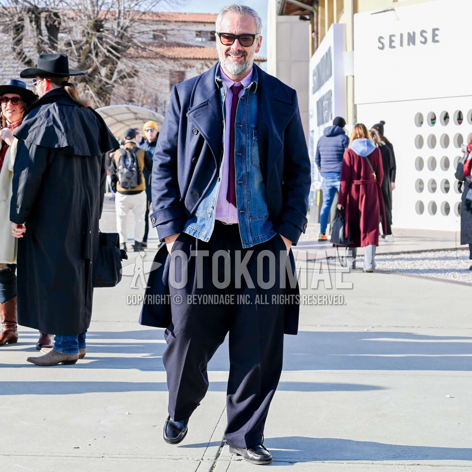
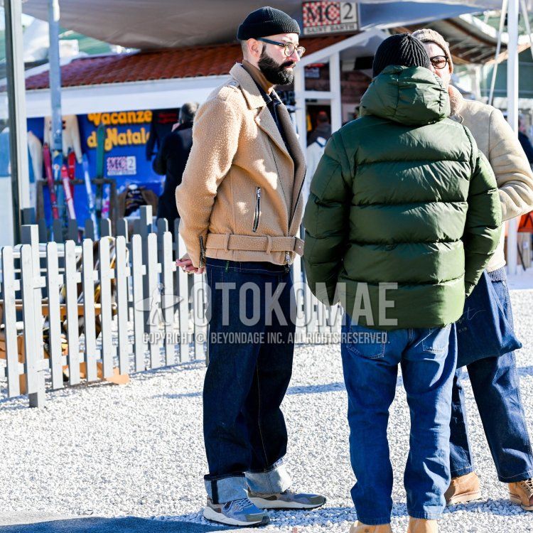
Earth Color Coding Tips 1Tone-on-tone earth color coordination uses different textures of materials to create a three-dimensional effect
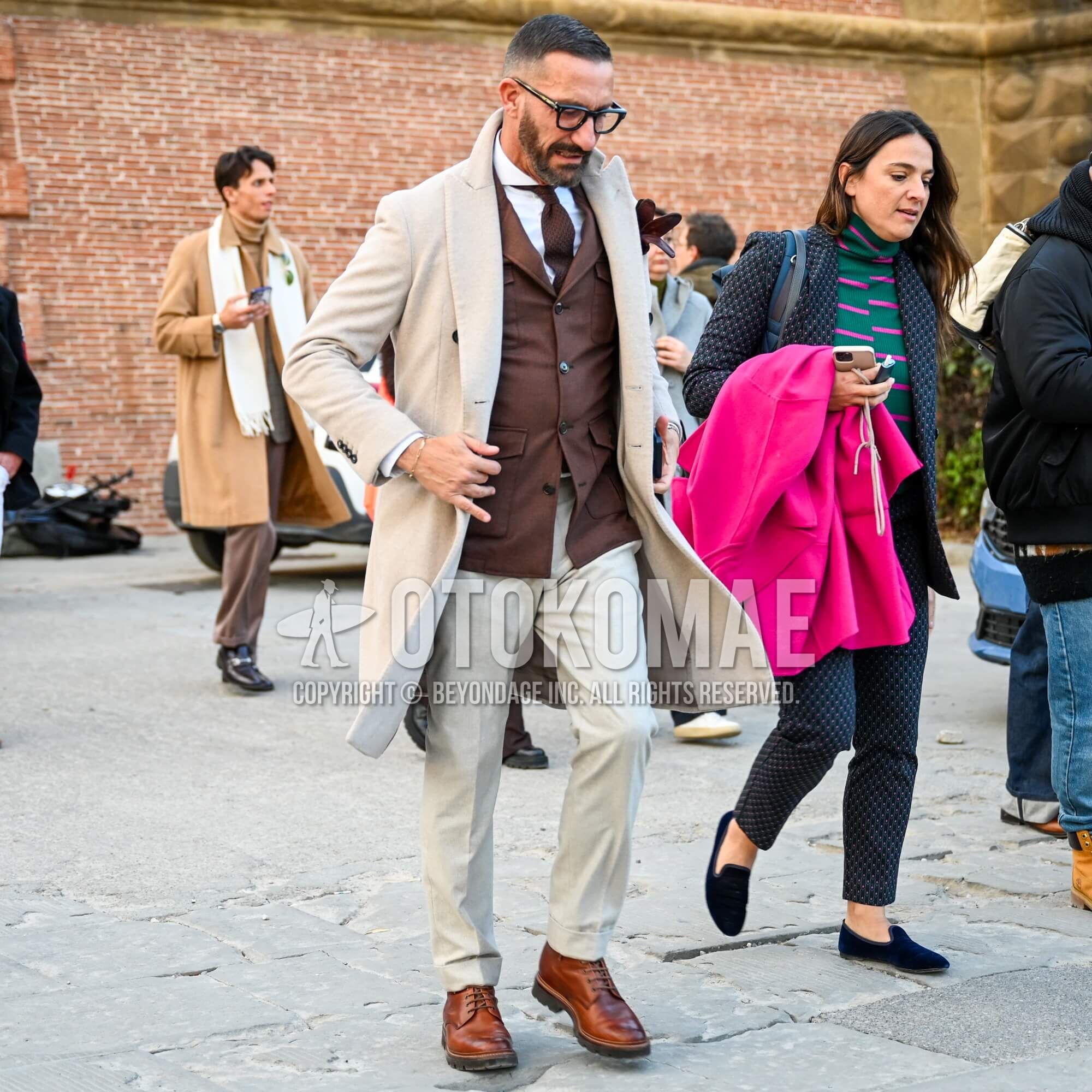
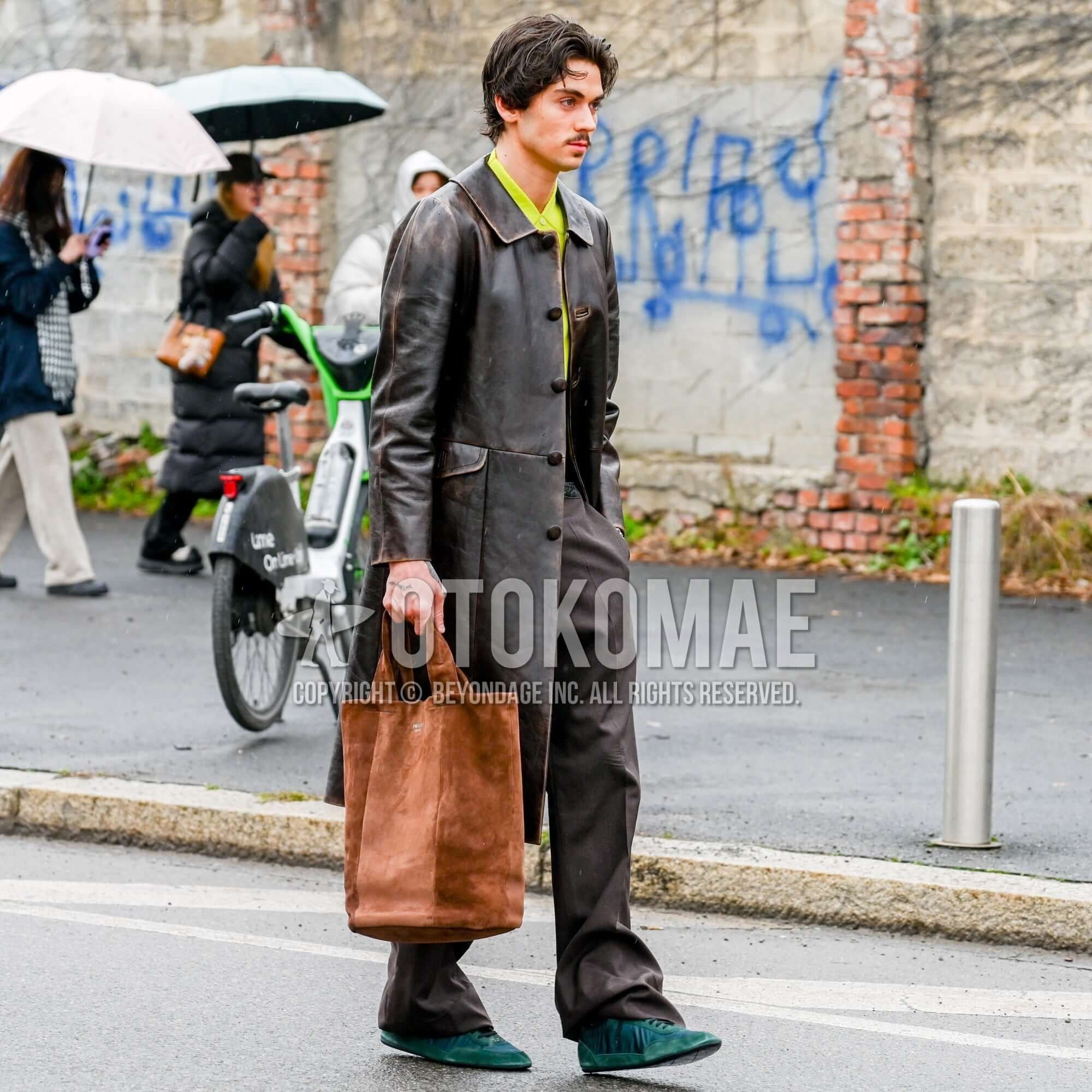
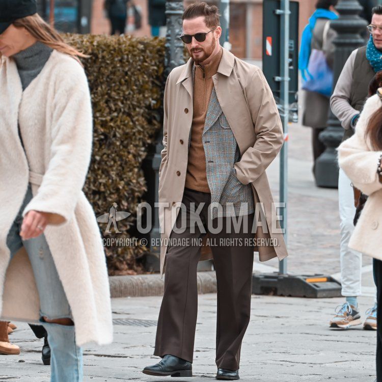
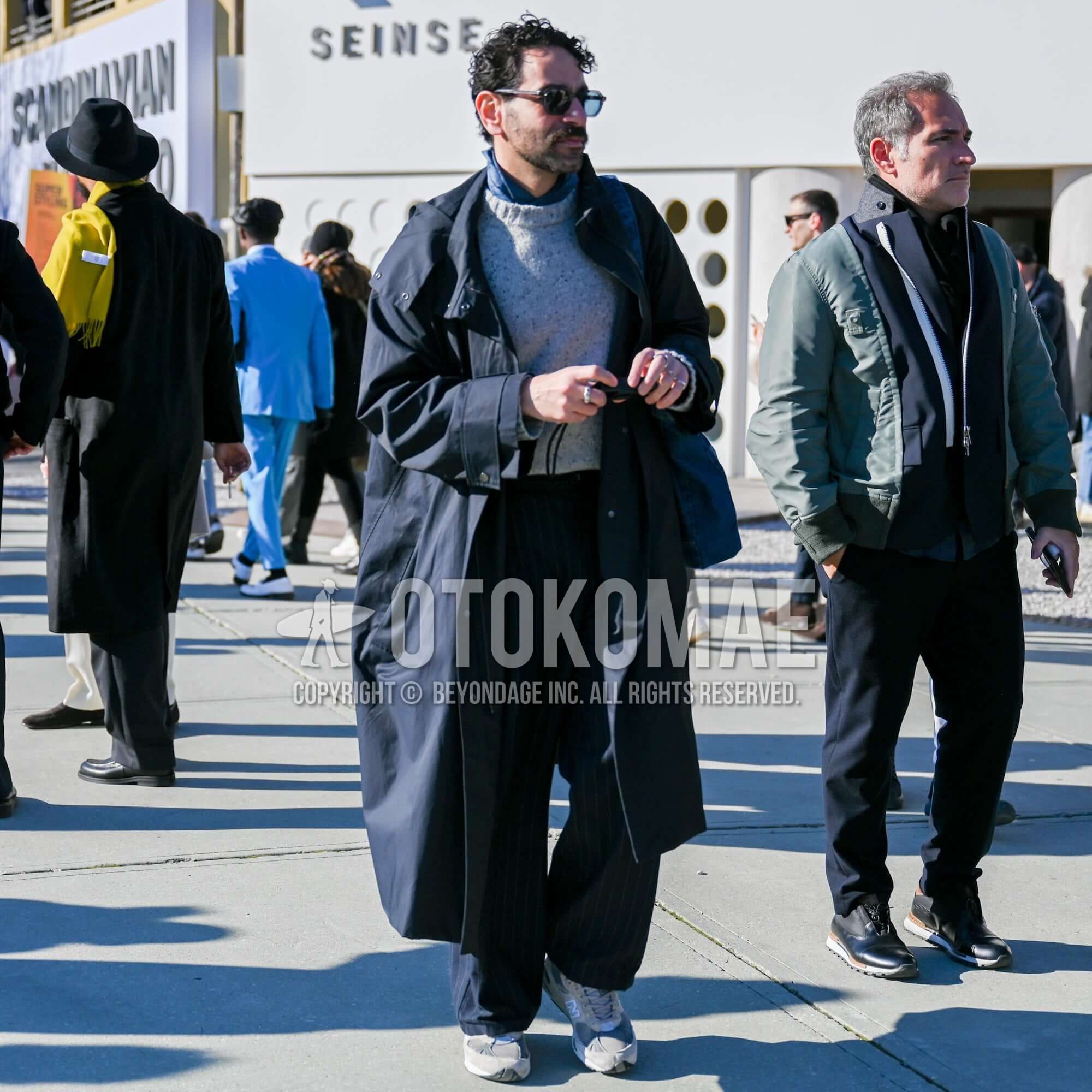
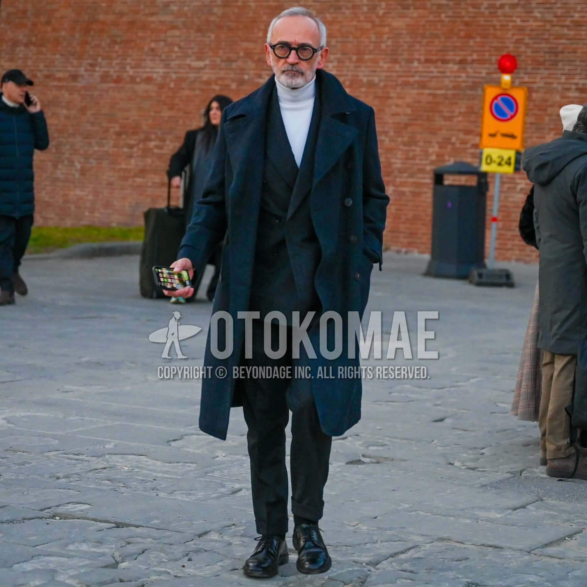
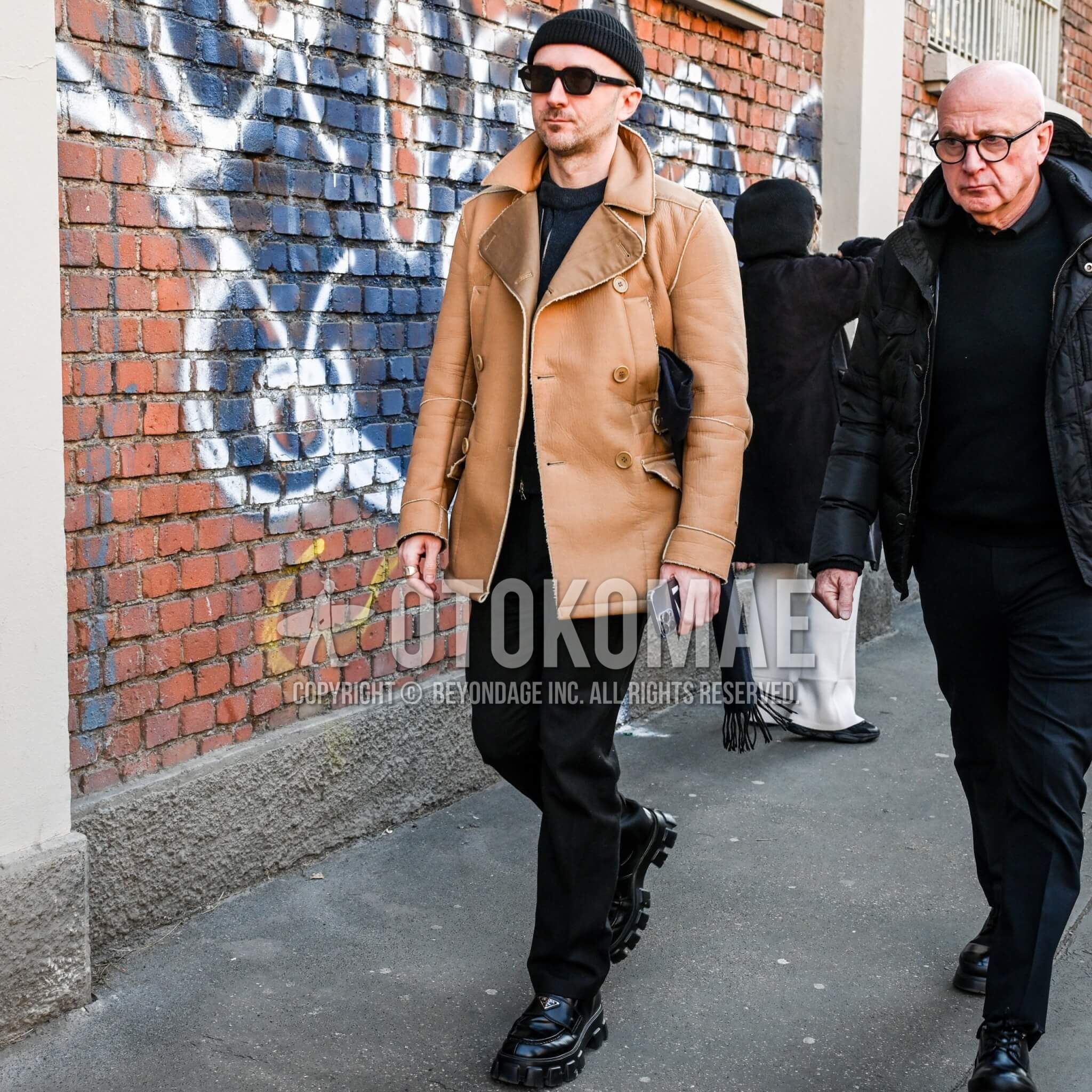
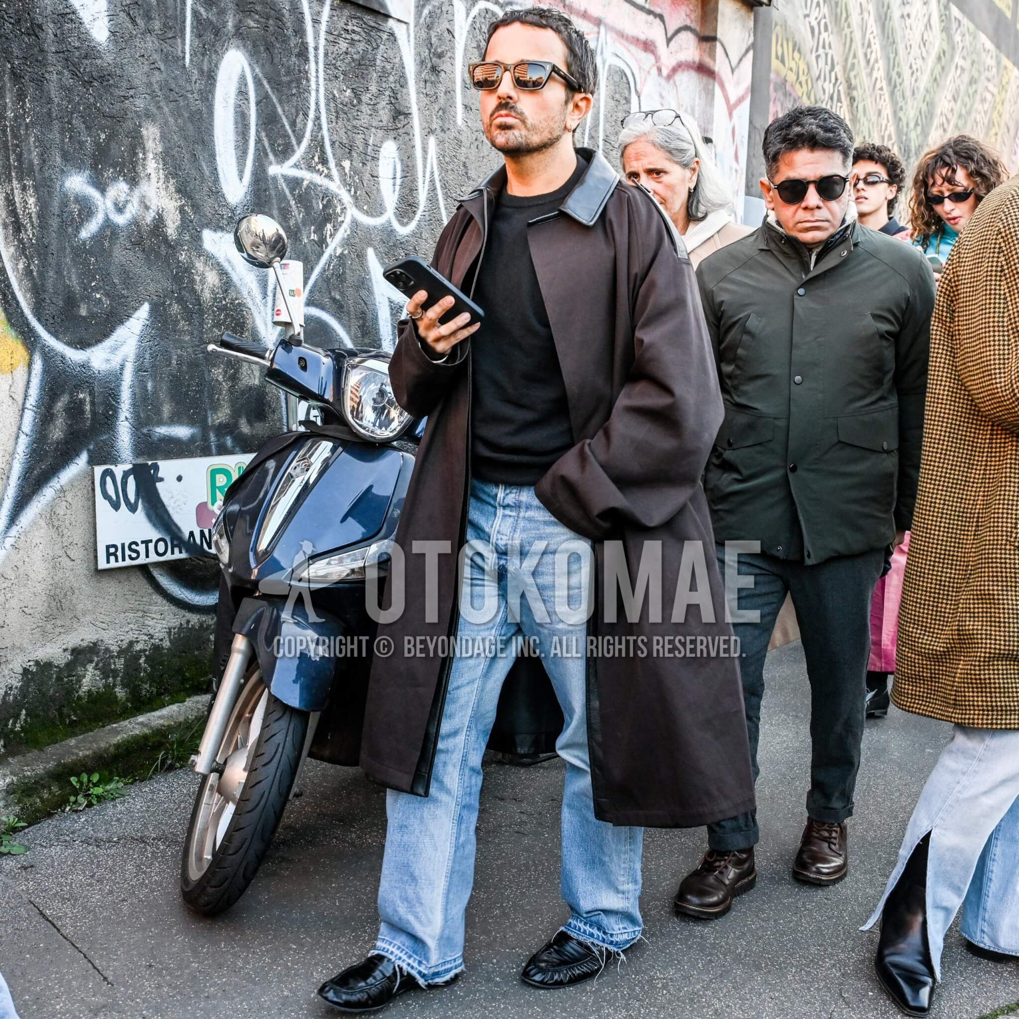
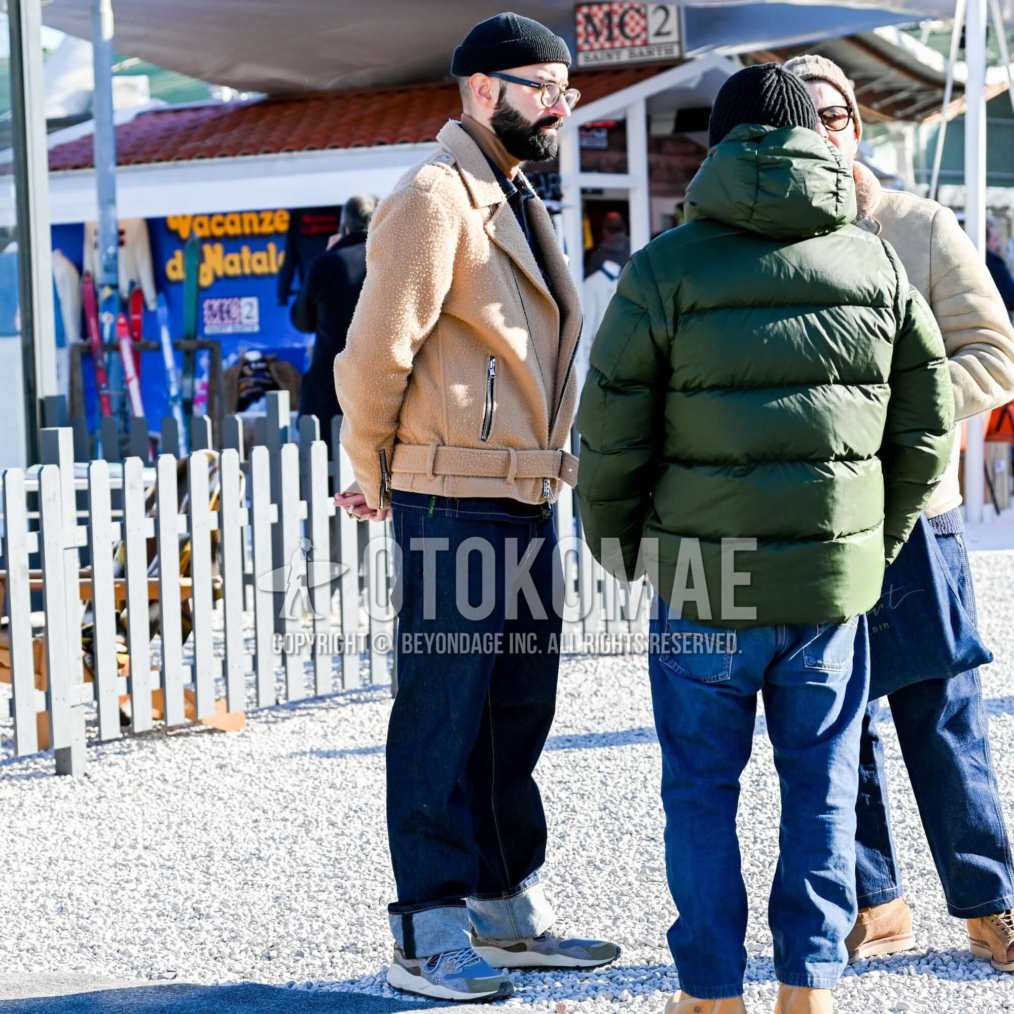
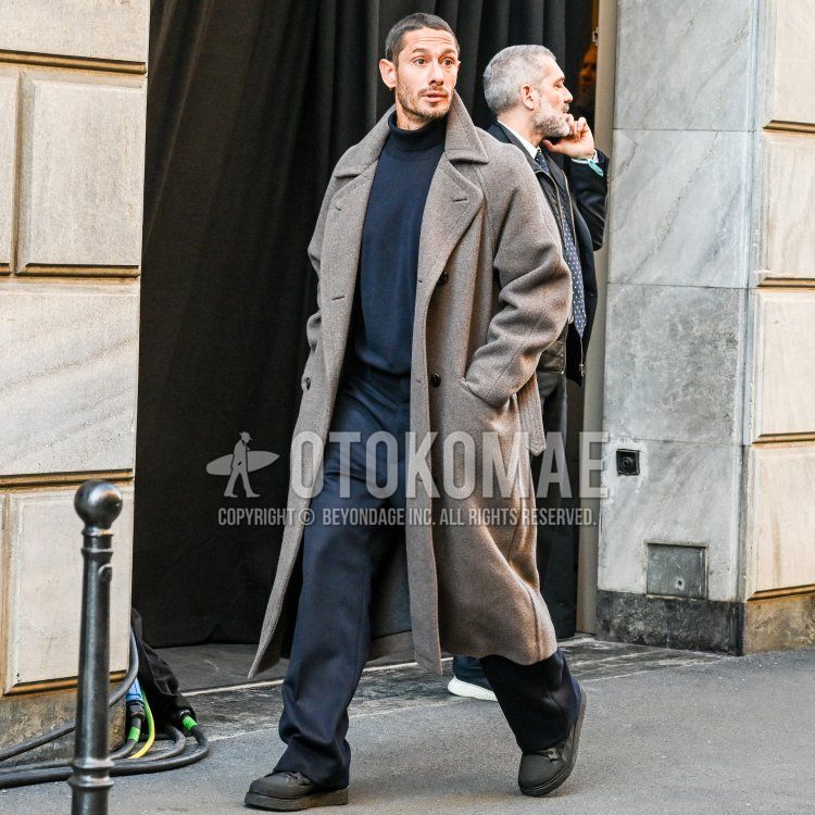
Tone-on-tone coordination, in which the entire body is in a similar color, maximizes the calm impression and relaxed feeling that earth colors have. However, depending on how the colors are matched, they may give a flat impression. The key to solving this problem lies in controlling the “reflection of light” through contrasting the brightness of the colors and the difference in texture. For example, contrast navy with light blue, or combine light-absorbing linen or wool with a dry texture with shiny smooth leather or nylon fabrics that reflect light. Even if the colors are the same, the unevenness and luster of the materials create natural shading in the coordination, giving a three-dimensional depth to the single color.


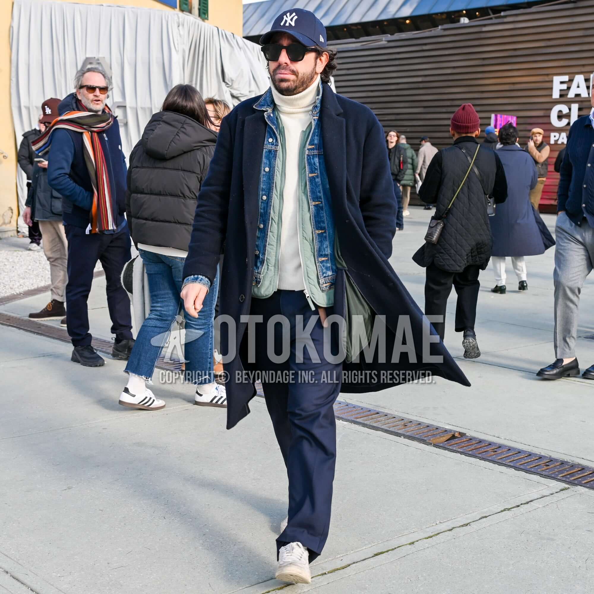


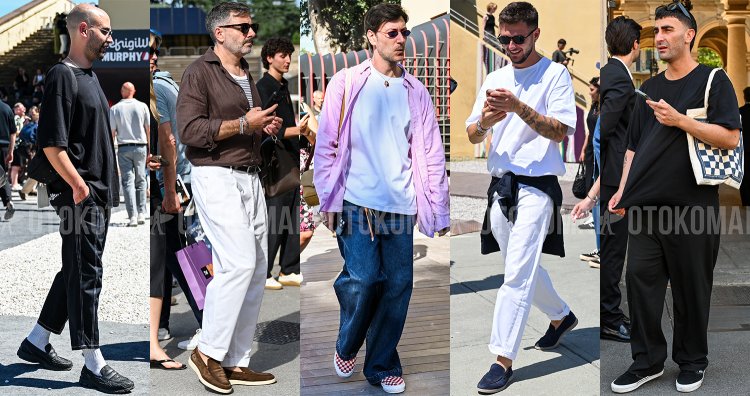
Earth Color Codes Tips 2Urban Earth Color Codes Contoured with Monotone Matching
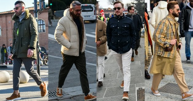
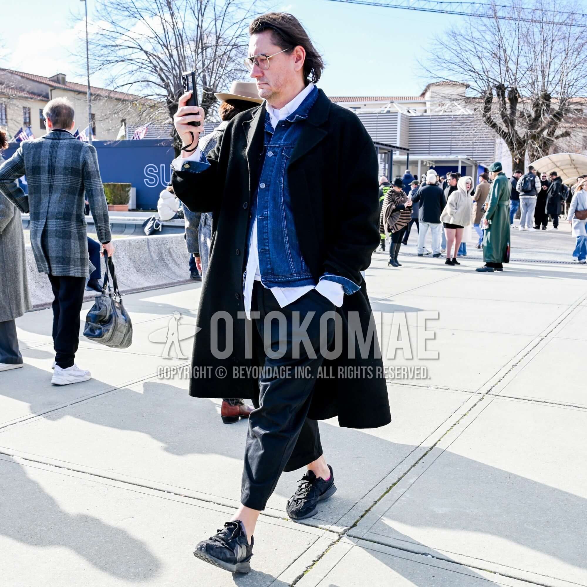
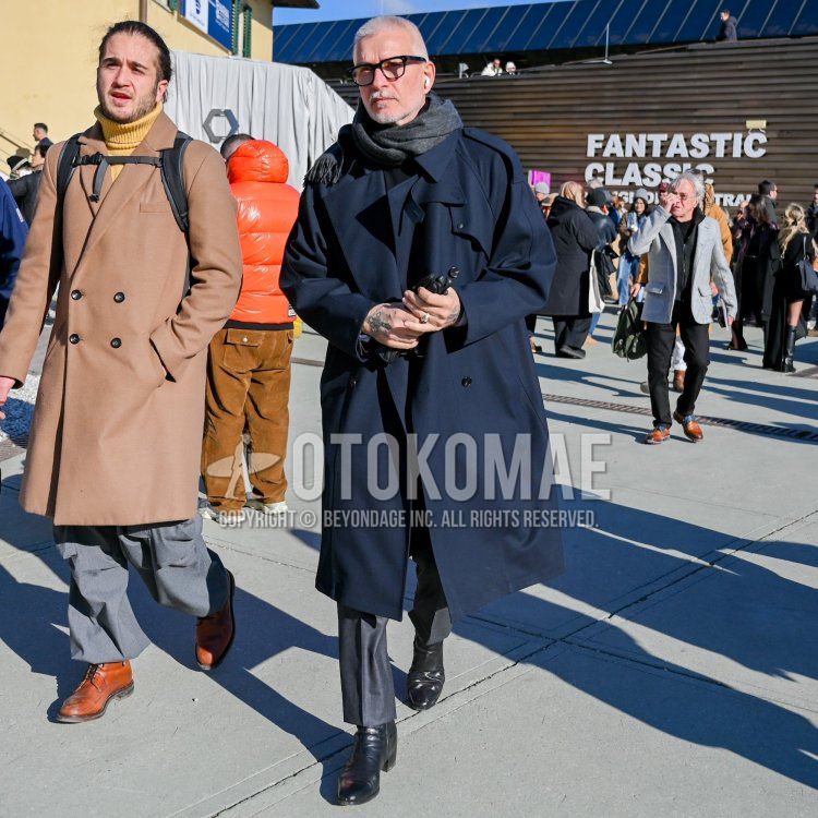
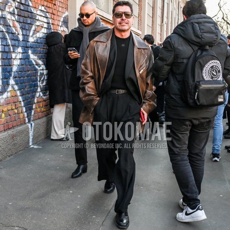
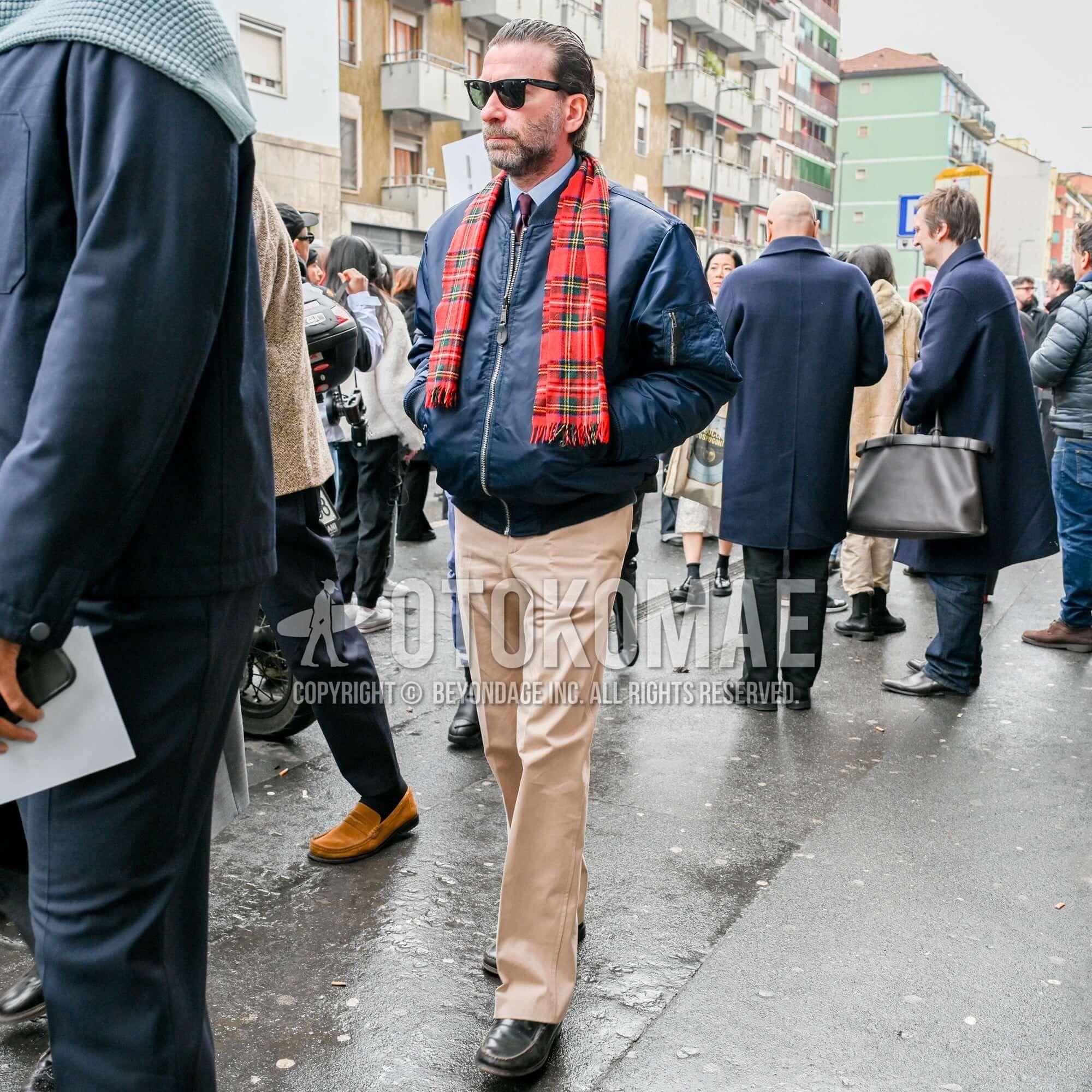
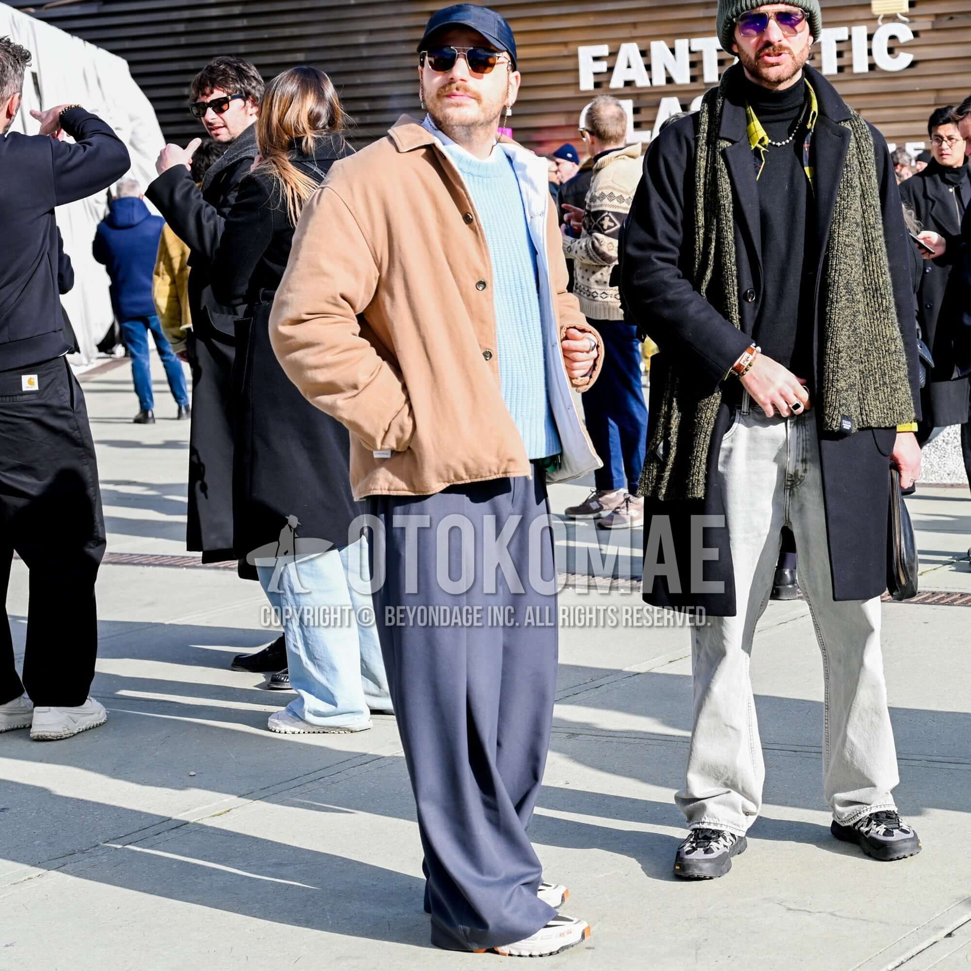
The gentleness and calm tones inherent in earth colors are a great attraction, but they can sometimes look drab in an urban landscape. What is effective is to use monotone items in black, white, and gray to create an “urban edge” to the outfit. For example, a clean white color peeking out slightly from the neck or hem of an olive or beige outfit can be used to create a “break” in the outfit, or black slacks and shoes can be used to add a sense of definition to the coordinated look. By separating and fixing earth colors, which tend to blur the frame, with achromatic colors, an intelligent and sharp urban style that transcends the context of safari and military wear is completed.


Earth colors. Color Coding Tips 3
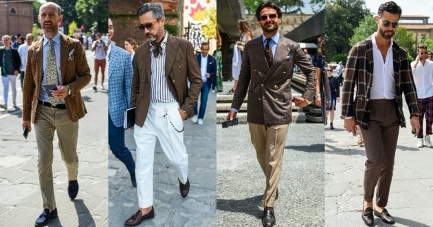
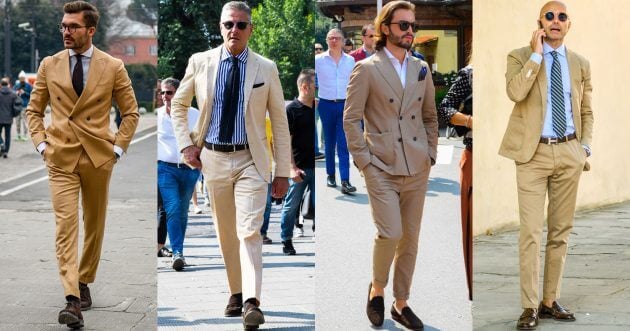
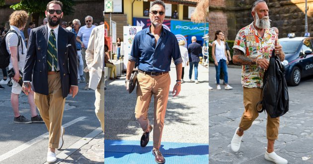
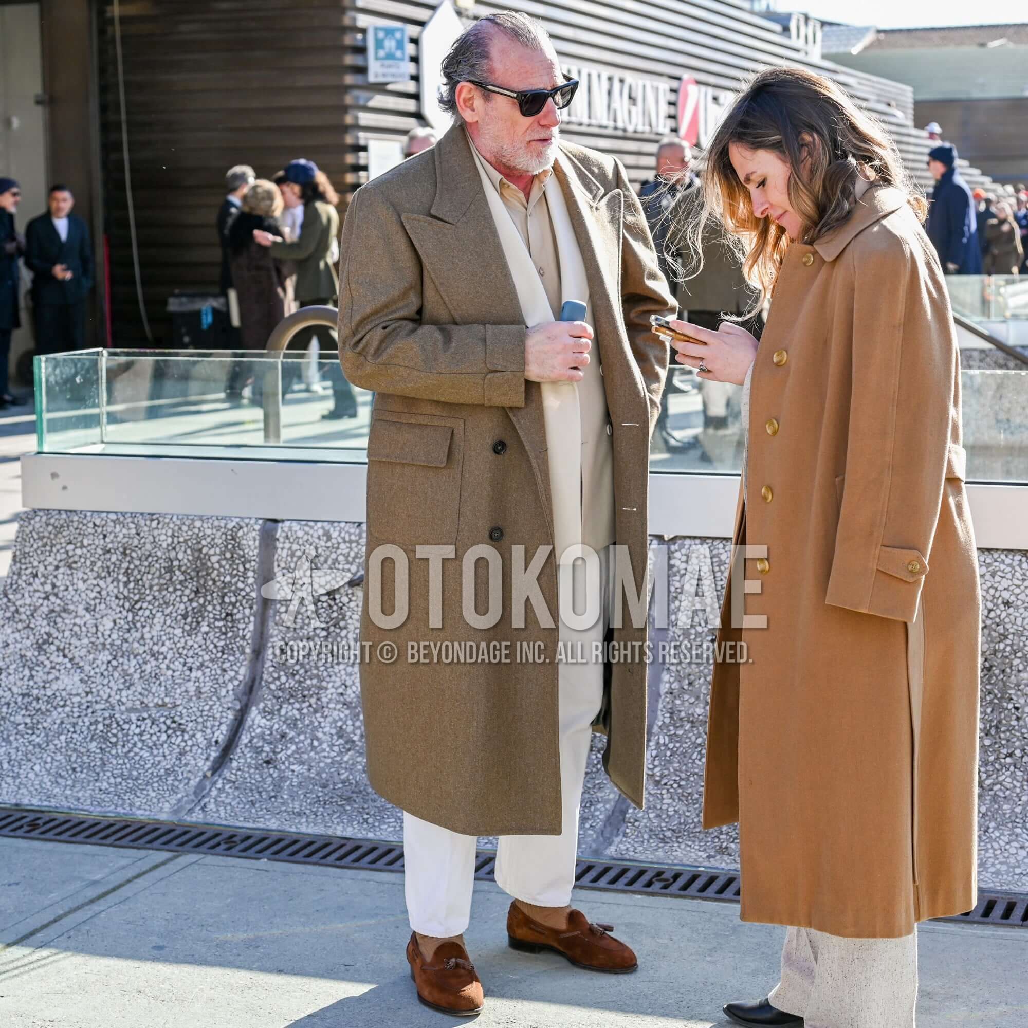
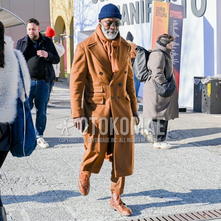
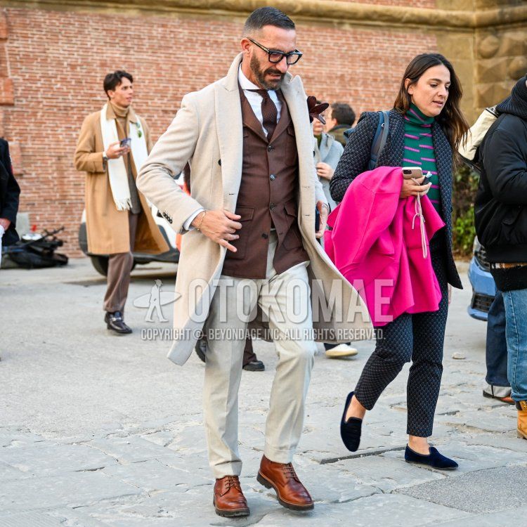
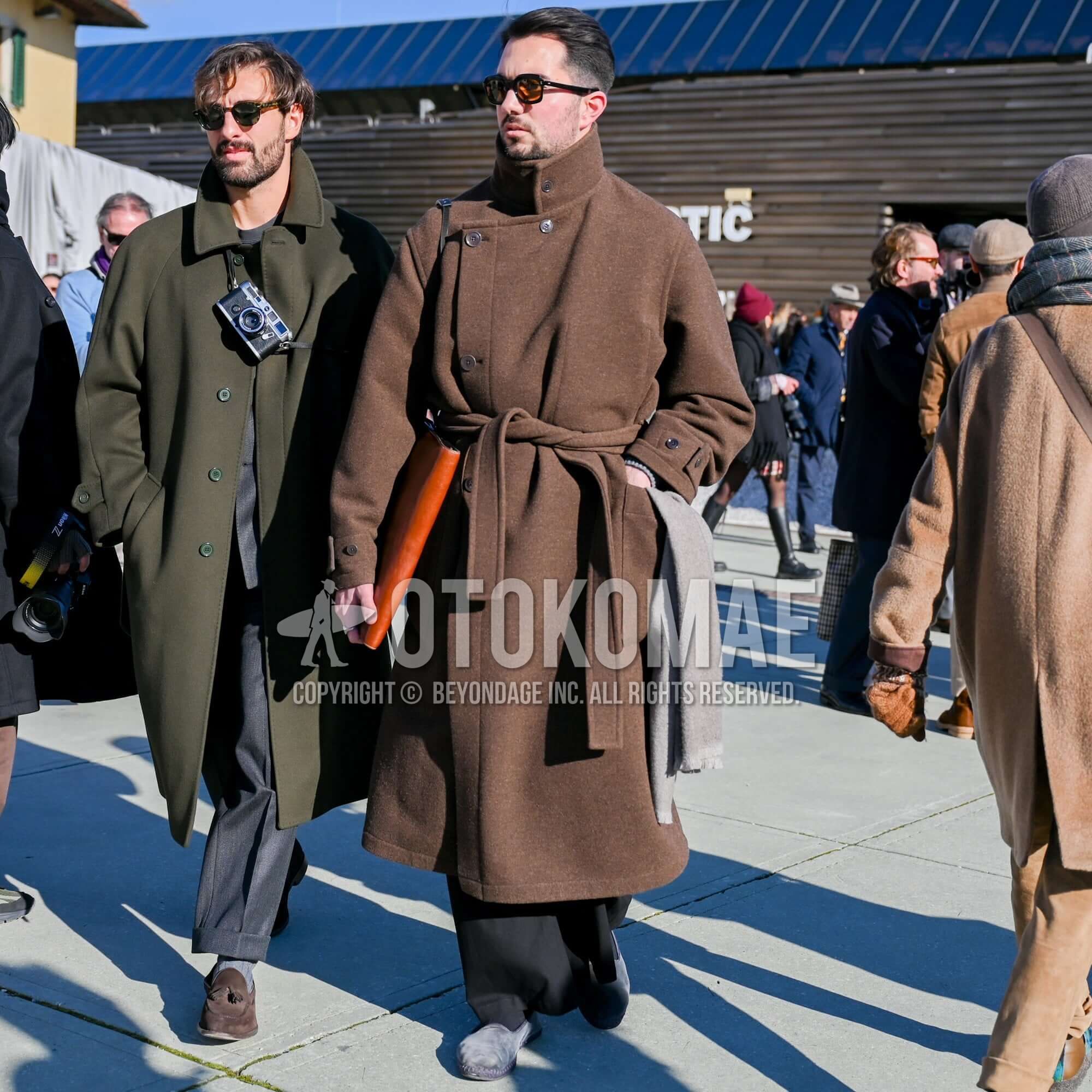
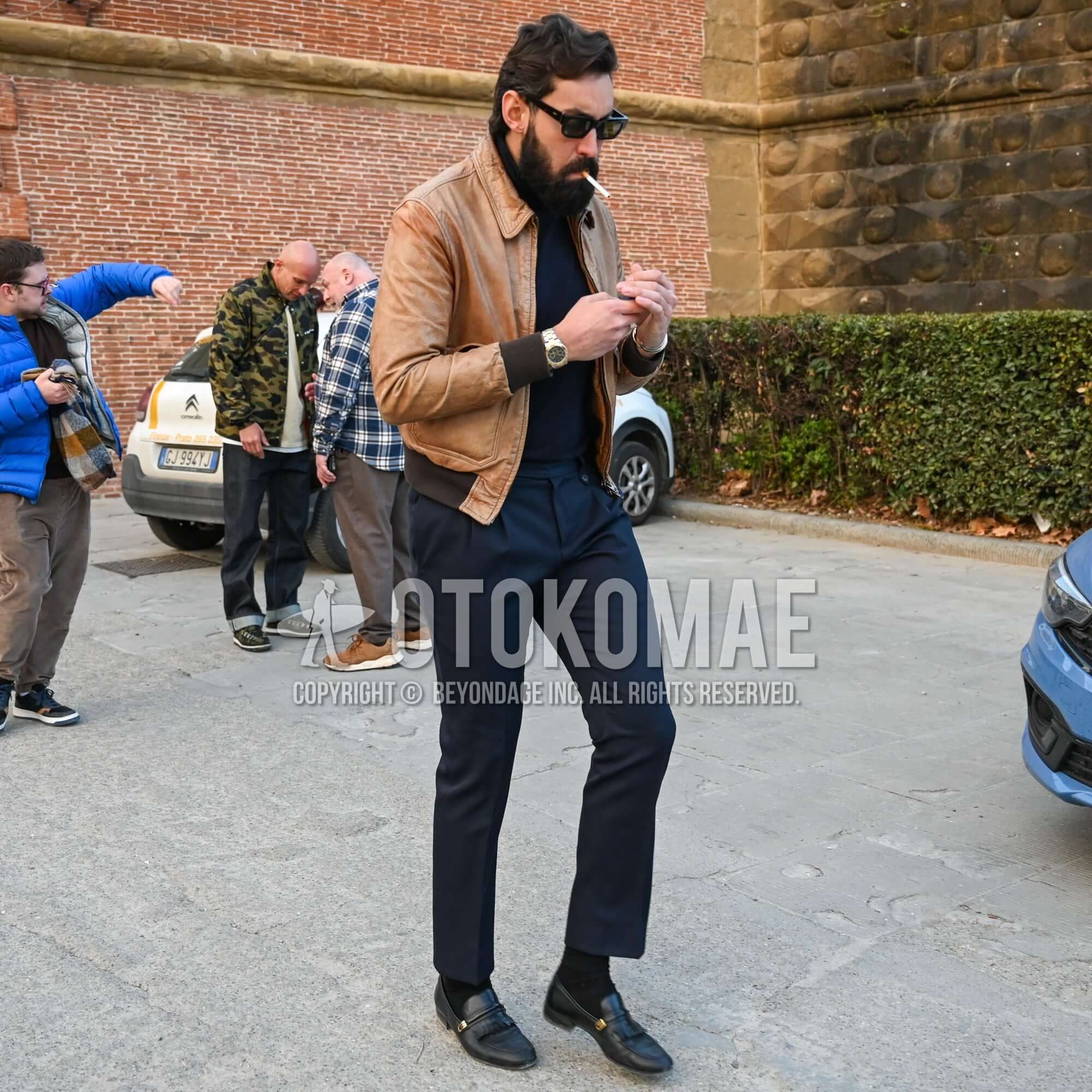
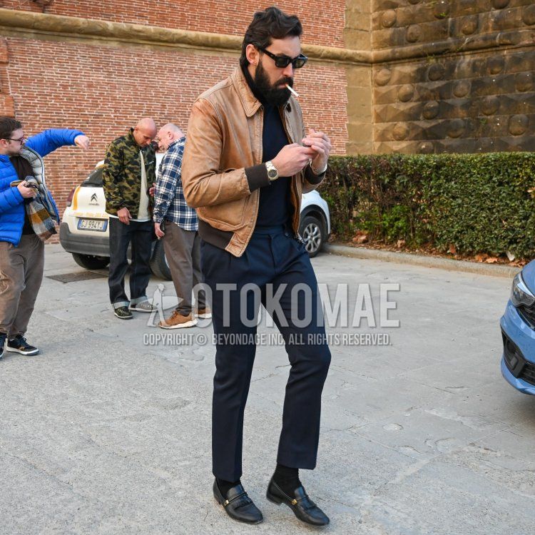
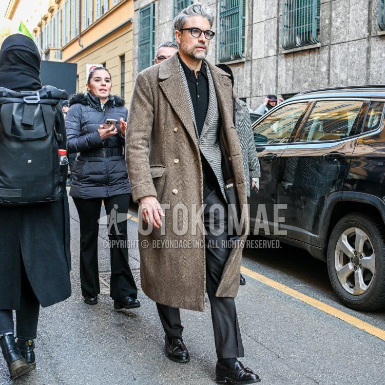
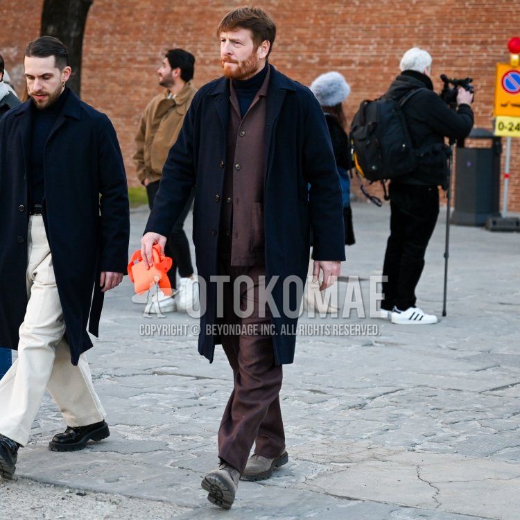
The “Azzurro e Marrone” coloring (earth colors of the sky and earth) beloved by fashionable Italians is basically a combination of navy and brown, but you can also lighten the brightness or change the saturation. One correct interpretation of the pairing is to enjoy a broader interpretation of the magnificent contrasts that exist in nature, updated in a modern way. For example, pairing terra cotta, which is reminiscent of red earth, with a clear saxophone blue. The combination of complementary cold and warm colors creates a stylish visual effect that enhances each other’s colors.


![How to Wear a Brown Suit in Style [ 2021 Newest ].](https://otokomaeken.com/wp-content/uploads/2019/04/a-1-630x331.jpg)