Sponsored by
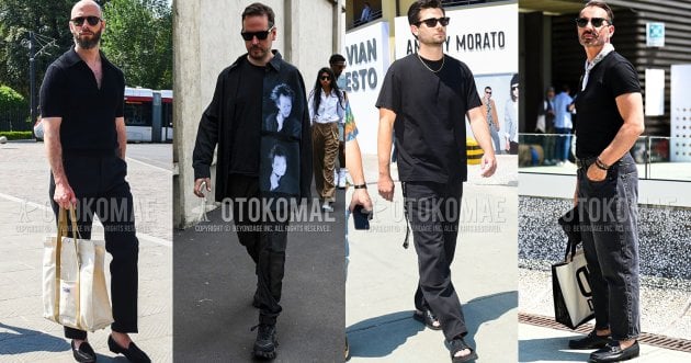
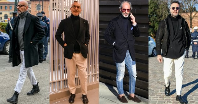
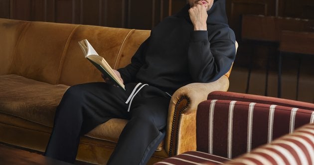
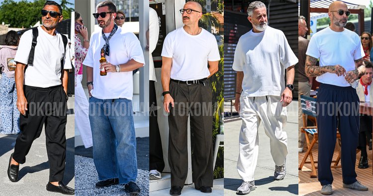
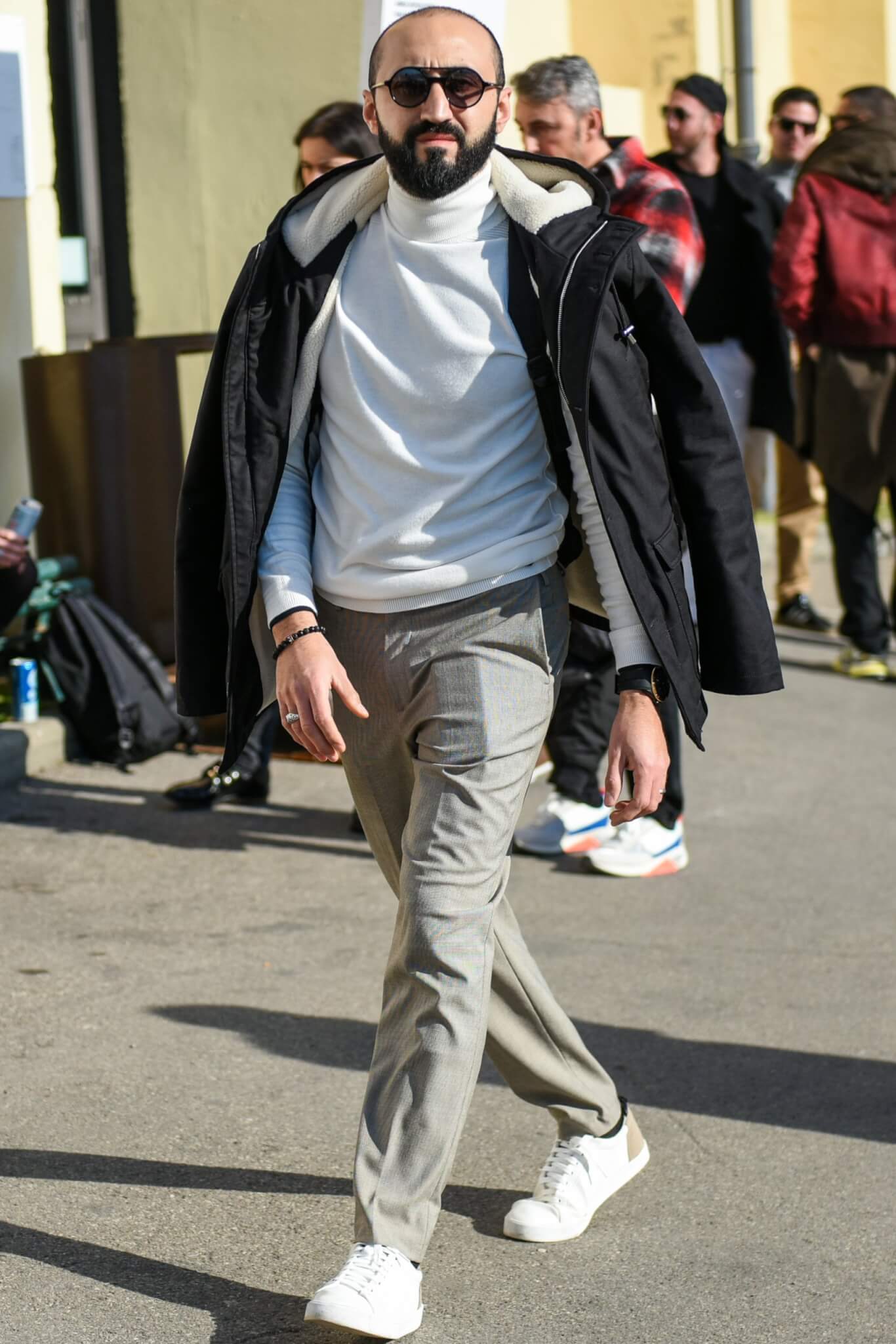
The gradation of colors from white to gray gives the monotone coordinate a beautiful finish
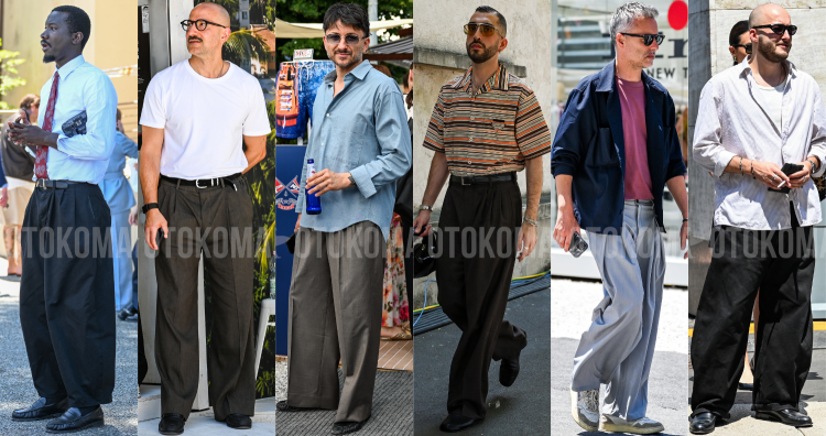
While a crisp monotone coordinate is good, a monotone coordinate with subtle gradations of color is also hard to ignore. In particular, the gradation from white to gray creates a clean, youthful, and elegant mood, and is ideal for differentiating from the cool monotone coordinates of the past. It gives a sense of depth and breadth that is completely different from bold, aggressive monotone coordination, and gives the impression of a mature, relaxed atmosphere.
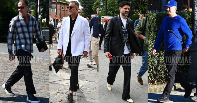
For example, here is a men’s monotone coordination…
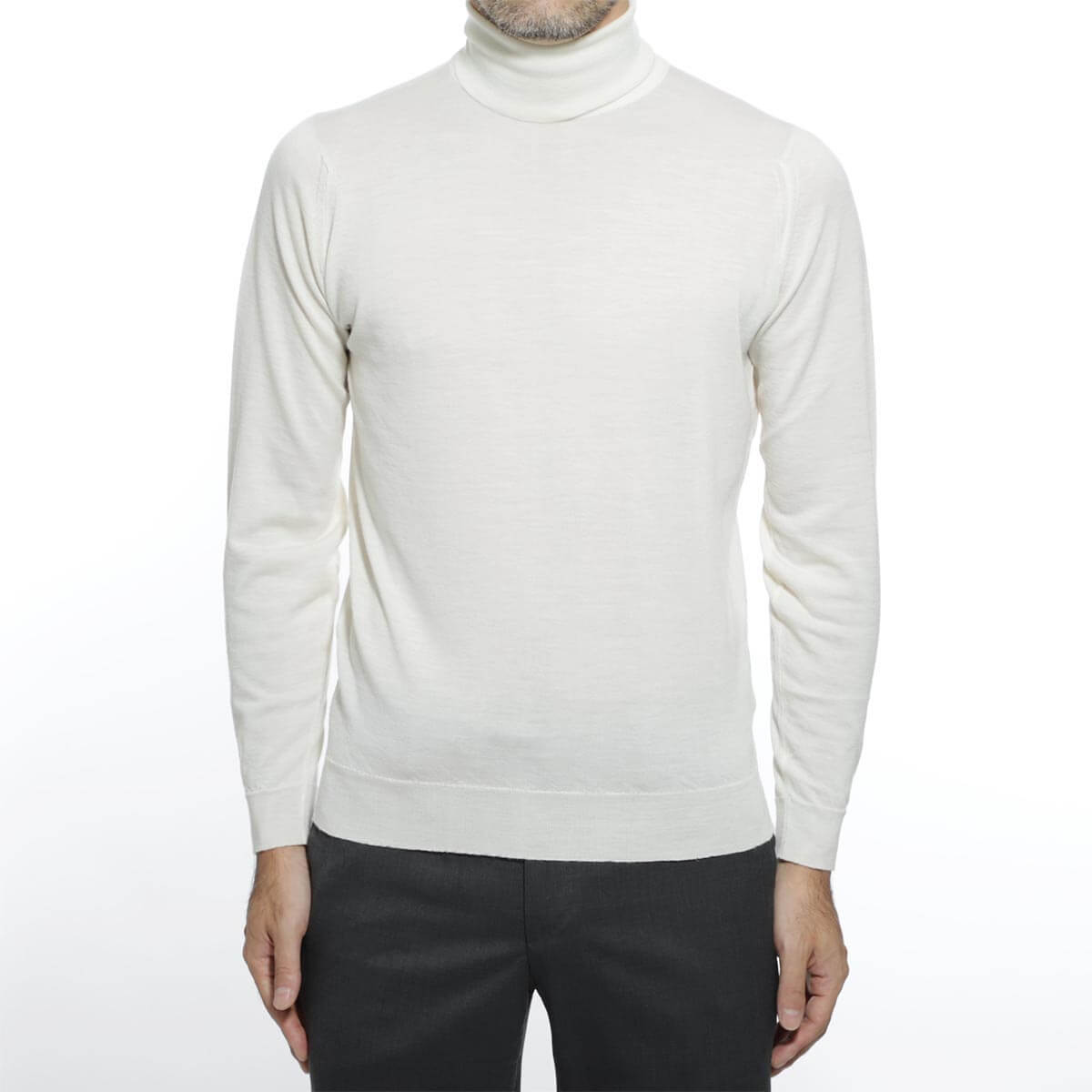
| John Smedley knit | Click here for details |
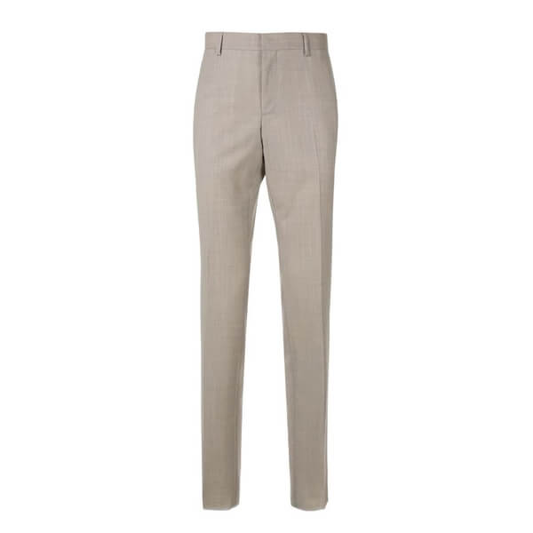
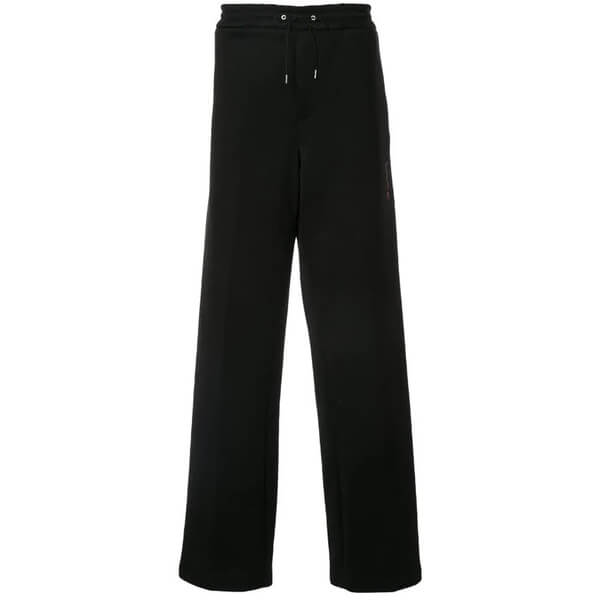
| Cerutti 1881 slacks | Click here for details |
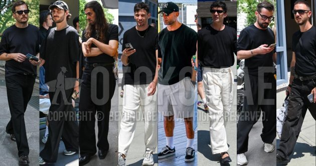
Monotone coordinates with a relaxed silhouette for a more seasonal look
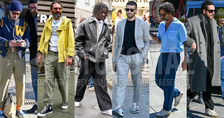
In the past, stylish and chic outfits were the hallmark of monotone coordination, but nowadays, when outfits that are out of the ordinary, playful, and casual have become the standard, monotone coordination with a loose silhouette is also quite acceptable. Sometimes, daring to shift the tuning or blur the focus can refresh the styling and give it a new appeal.
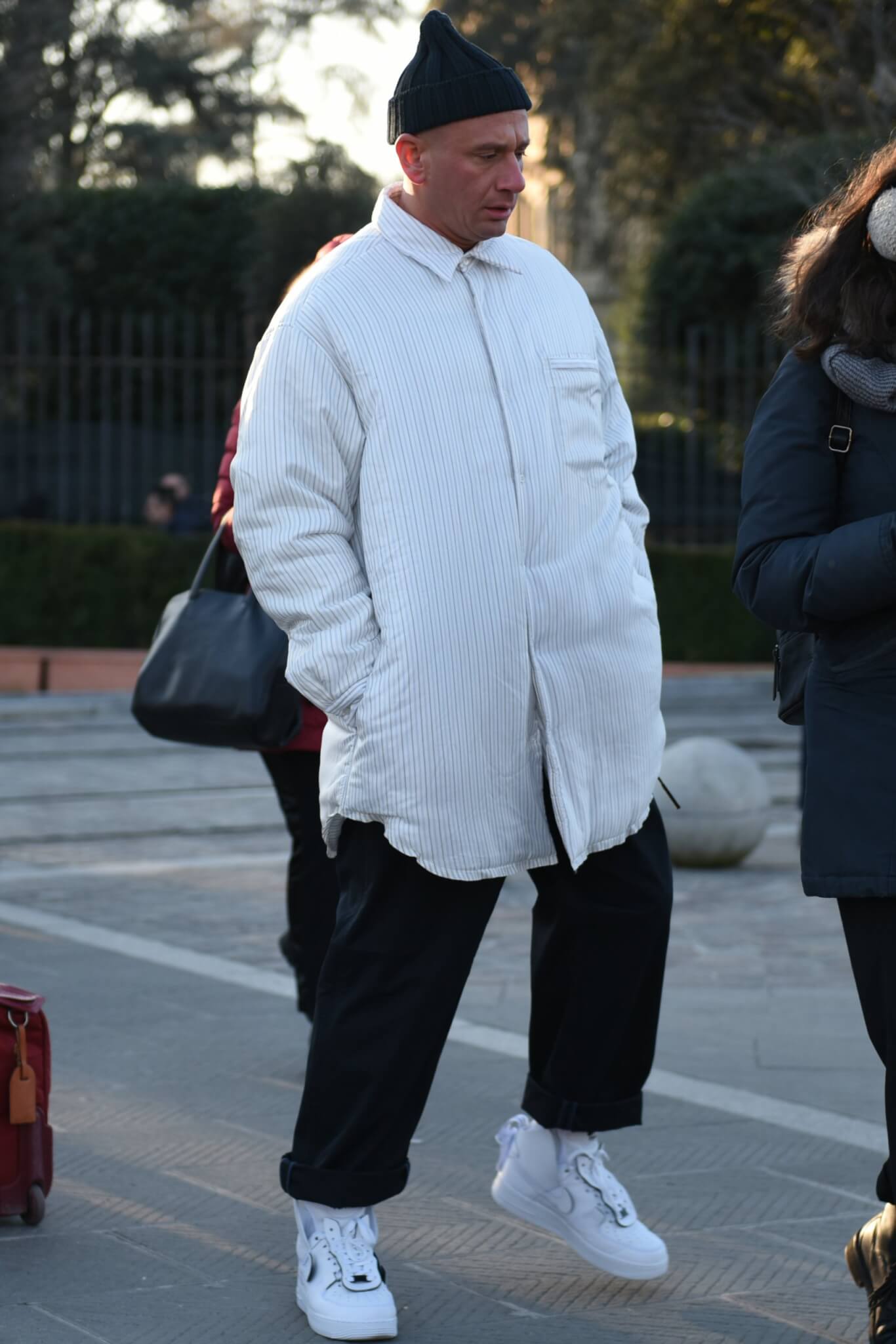
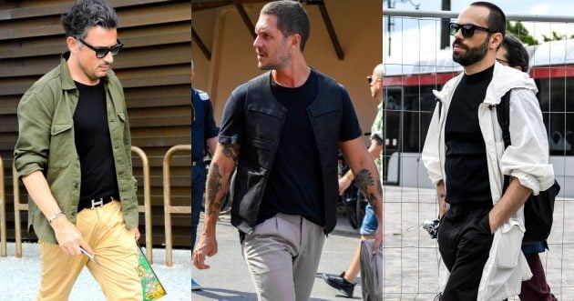
For example, a men’s monotone coordinate like this…

| OAMC pants | Click here for details |
| Nike sneakers | Click here for details |
![Summer Codes Men’s [2021 Edition].](https://otokomaeken.com/wp-content/uploads/2020/04/591d43057a4d0d941996b2b9470edeee-630x331.jpg)